
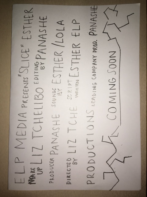
Digital editing:
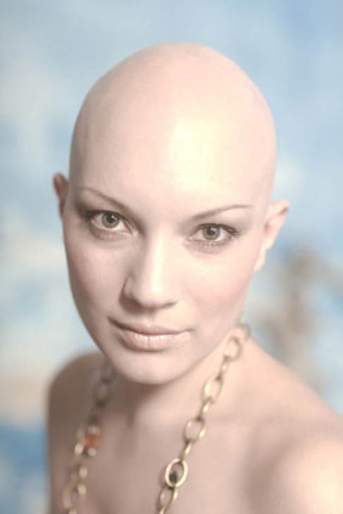
Our antagonist is a female. I therefore looked for images of a bald female. The reason I chose bald for this initial idea is because it's a stereotype for women to have hair (typically long) so that idea was subverted and instead she has no hair. It is arguable that by having a bald headed women she resembles a man which emphasises male dominance which contradicts our film idea of a female antagonist.
Our antagonist is a female. I therefore looked for images of a bald female. The reason I chose bald for this initial idea is because it's a stereotype for women to have hair (typically long) so that idea was subverted and instead she has no hair. It is arguable that by having a bald headed women she resembles a man which emphasises male dominance which contradicts our film idea of a female antagonist.
|
|

|
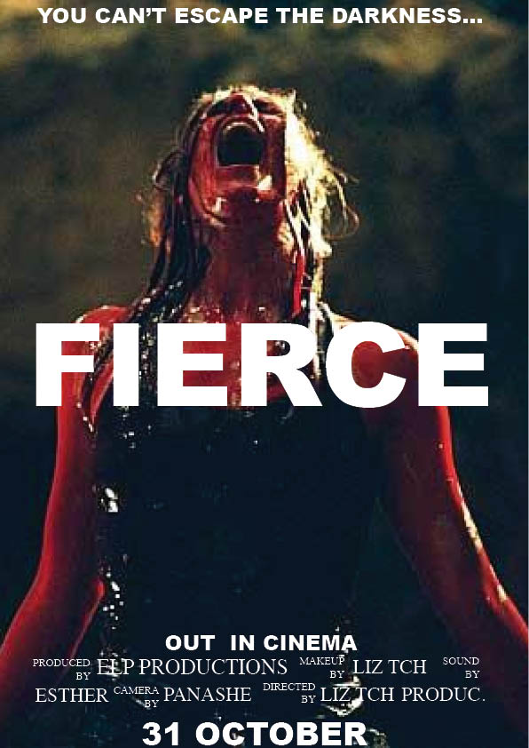
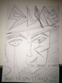
When creating the final poster for our movie trailer. I aim to follow this type of layout and editing. The dominant image must be a mid close up shot of the antagonist and because our one is a female, she must follow certain conventions such as messy dark hair which connotes ideas of death and evilness. In the image, grey hair is denoted which connotes mist which could further connote mysteriousness which ties in nicely with evilness. The red colour used for the headline connotes ideas of blood and violence, which again suits horror movies, especially our one because there is violence in it. The font was also created and designed in a way to appear sharp as if to resemble a knife. This was done intentionally because it suits the plot of the story (she uses sharp weapons to harm her victims). The billing is another typical convention found on posters and will consist of the names of those in the task along with the roles assigned to each person.
Hand sketched posters:
My initial idea for our poster was to have a close up shot of our antagonist as the dominant image. The lighting was going to be on his right hand side to create a shadowy effect which would connote ideas of mysteriousness. The close up would also help focus on the details on his face such as the slice on his right side. By allowing the light to be on his right it further focuses on his scar which shows he has been cut with a knife which is very suitable for the name of the movie "Slice". The scar further connotes ideas of violence, weapons and blood which are conventional for slasher horrors. The facial expression is very angry as his eyebrows are furrowed and he has heavy eyes which can be seen as he has eye bags. This connotes anger therefore suggesting some form of violence could be present during the trailer/movie. This title "Slice" has been put in the bottom centre of the poster to hide the antagonist's mouth to further connote mysteriousness from him. The title has been designed in a way to look "sharp". It has only sharp lines connecting each other to form letters (no curved sides) and this all contributes to the idea of sharp weapons being used. The name of the production company "ELP Productions" has also been plastered right underneath the title to gain recognition towards them and further follows the idea of sharp weapons used which emphasises the title "Slice". The catch line has been placed on top of the poster to grab attention to it. By not only having a catch line but to also put it in the top, the audience are most likely going to remember it especially as it's short. I decided that the font used would not be sharp to allow the audience to easily read it. The title would be red to resemble blood and connote ideas of violence and death. The background would be black to emphasise ideas of mysteriousness and the subheading and catch line would be a yellow/orange colour to connote ideas of fire which would further build adrenaline in the audience.
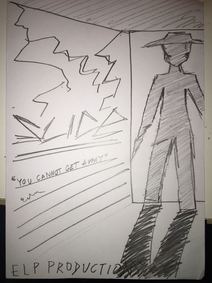
The second idea denotes a figure at a door entrance with a knife in his hand which connotes the ideas of violence and blood which is suitable for the film title as well as the plot. The poster also denotes cracks in the wall which connotes ideas of a troubled character and destruction which of course is the antagonist's character. The cracks could also represent the antagonist's life giving reason for him to behave in a violent way. The shadowed body and shadow denoted on the floor all contribute to the idea of mysteriousness which is conventional for an antagonist. I'm not a very big fan of this poster as it doesn't look "scary" enough as it's literally just a black figure holding a knife at the door entrance. The fonts used for the title, name of the production company and the catch line are all suitable as they are all "sharp" and emphasise the ideas on knives which further connotes violence. Despite these conventions being used, I prefer my initial idea.
My third idea denotes the antagonist hovering over the victim with a knife. This emphasises his power and violence over the victim and further shows his dominating power. The title follows the sharp idea to represent the knife which further connotes the ideas of violence. The body language that the antagonist holds with his arms in the air further emphasises that power and perhaps even violence as he appears to be ready to attack the victim. Again, I don't like this idea as much as the initial one as it doesn't look "scary" enough. I also pictured my team and I producing the poster and it wouldn't look as effective in terms of the presentation and there's only so much editing we can do to make it remotely frightening. The facial expression that the victim has is eyes wide open with their back facing the antagonist which I believe is an effective way of showing the audience who the victim is without having to physically say so.
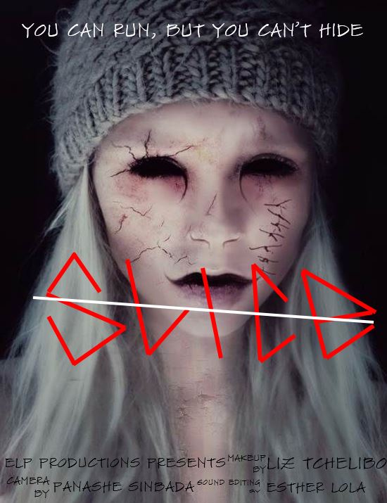
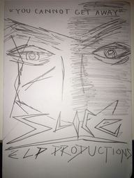
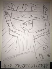
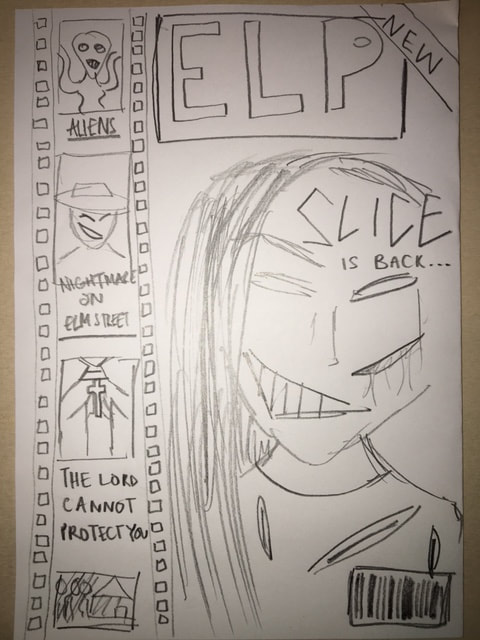
In the final poster idea I designed, it denotes 2 faces (only half shown), one of which is crying with his mouth wide open, which means he must be a victim, whilst the other's eyebrows are furrowed with a malicious smile. By sketching the victim's face like this, it clearly shows the audience that it's the victim whilst the mouth wide open expresses shock and further emphasises that fear. The antagonist is denoted behind the victim to emphasise that sense of dominance as the victim can't see her and is therefore left vulnerable. The scars denoted on the antagonist's face were caused by cuts hence the title of our movie "Slice". Furthermore, the hat that she is wearing is used as a way to hide her identity and further build fear in the audience as by hiding away, it prevents us from being able to see her properly consequently building fear within us. The title of the movie is denoted at the top of the poster as it grabs the audience's first look and attention towards it. The font of the title is unique and connotes ideas of violence as it resembles sharp objects such as knives. To add to this the imagery of knives leads us to the idea of a phallic object and as knives penetrate skin, this imagery altogether represents teen punishment in horror movies, which is essentially what our movie is about. The name of the production company is at the bottom meaning it doesn't grab the audience's attention immediately; nevertheless it is in the centre and follows the same font that the title has. This is my favourite poster as it suggests to the audience what kind of sub genre it's based on and furthermore hints what it is about/how the victims are hurt. The layout is also very neat and it is something that my group and I can recreate with Photoshop without difficulty whilst still appearing impressive.
Inspirations:
|
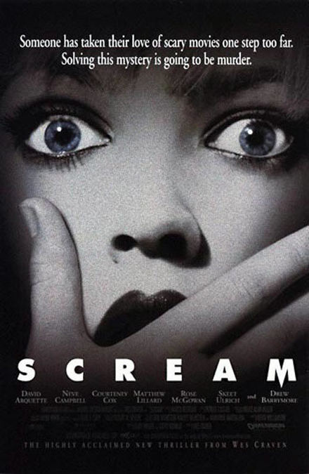
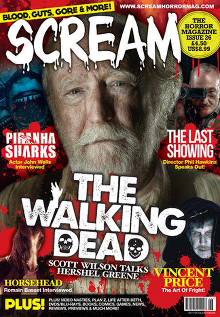
The poster for Scream is very similar to one of my hand sketched posters as he close up of the victim's face is there and the presence of an antagonist is made clear through the use of a hand covering her mouth however on my poster I have denoted the antagonist's face behind the victim. Furthermore, the title of the movie is denoted at the top for my idea as I believe it would draw more attention to the audience of what the name of the movie is however the inspired poster has it denoted at the bottom but in a bright white shade meaning that it will still catch the audience's attention. When including colour on the final poster, this is a feature I will consider.
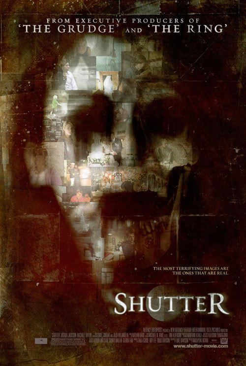
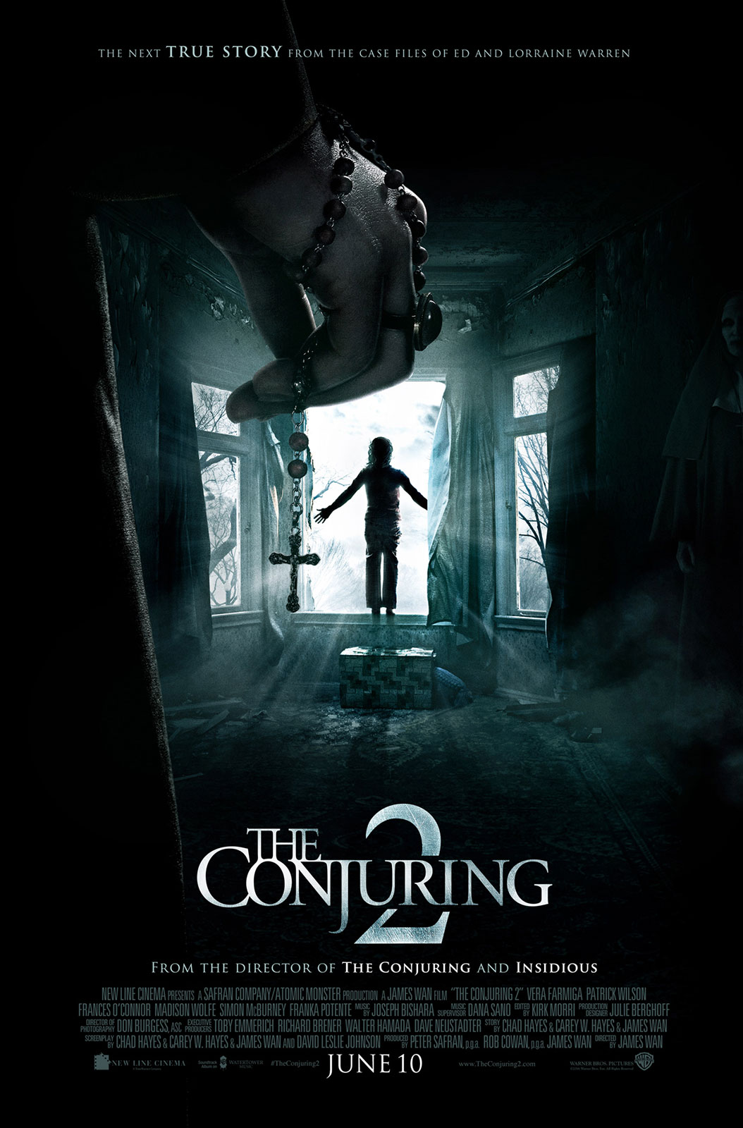
Another poster used to inspire me for the poster is The Conjuring 2. The mysterious character standing at the door with its shadow hiding its identity connotes ideas of mysteriousness and for that reason, I inputted that onto the poster. The poster created also denotes a weapon that the character is holding to further emphasise to the audience the role that the character plays in the movie i.e. the antagonist. The cover line has also been included to build adrenaline in the audience however although denoted at the top of the page, the sketched one is in the middle on the left of the page. The denotation of the crucifix held is used on the cover to denote ideas of religion and subverting ideas of comfort and faith. The third poster used for "Shutter" also influenced one of my own sketches as the minimal lighting on the mid close up of the antagonist has created a shadow effect which emphasises mysteriousness. |
A convention that should be considered and included is the billing of the movie a the bottom of the poster as this is a typical convention denoted on most professional horror movie posters.
The typical billings denoted at the bottom of posters include the names and roles of the "crew" that played a special role such as the person/people in charge of makeups and costume and similarly to the people in charge of the sound and editing etc. This is an effective way of ensuring a team that credit is given where due as these people would've played a very important role in regards to producing the movie.
Hand sketched magazine & inspo:
|
|
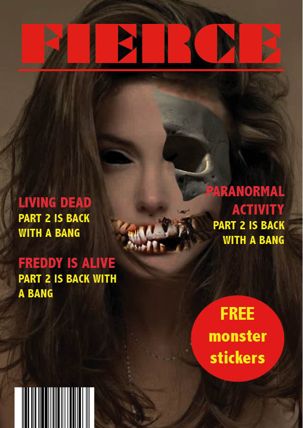
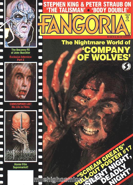
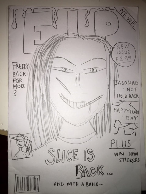
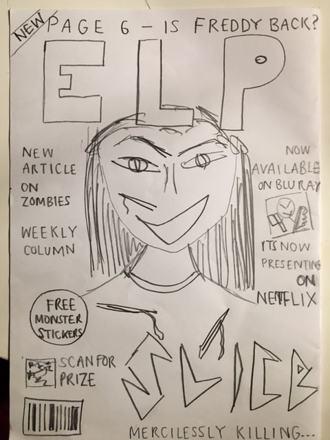
The magazine created is very similar to the Fangoria magazine I used for inspiration. The magazines consist both of masthead, cover lines, very similar shots for dominant images and graphical elements too. The dominant image denoted inn both are of the antagonists of each movie both with makeup effects and costumes to indicate to the audience what role in the movie they play. The secondary images denoted on the left of the magazine front covers consist of other characters from horror movies to emphasise o the audience the theme of the magazine.
|
|
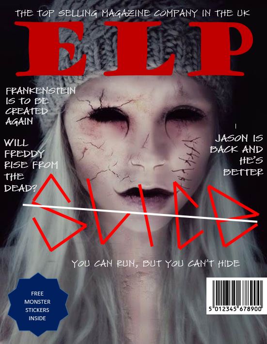
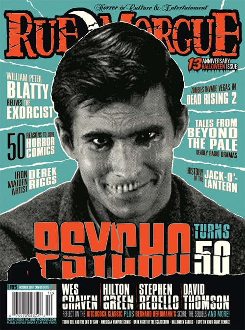
The front cover of these magazines are also very similar as they share the same kind of conventions and layout too. The masthead of the company's name is at the top and there have been graphical elements also inserted to suit the theme of the magazine; horror. The design used to suit it is dripping blood which connotes violence and death which is very suitable for a horror magazine. Furthermore, the type of shot taken of the dominant image is a medium close up of the antagonist to show off to the audience special effects makeup and how "scary" the movie is (as the antagonist will be from our movie trailer. There are also different graphical elements used to show off what the magazine consists of which is a typical convention which is effective for drawing the audience's attention. In addition to this the layout is also very similar as they both have the headline placed right beneath the antagonist along with secondary images and side headings about other movies also written which would further attract a large audience.
|
|
The two layouts for these magazines are also very similar as they both denote a medium close up shot of the antagonist. Unlike quite a few magazines analysed, the headline is at the bottom of the page which I think is fine because although some would argue that the attention isn't brought to it immediately and even perhaps blocked because when holding the magazine, your hand/thumb would cover the bottom right. Both magazines denote a personalised edited headline to suit the movie i.e. for the movie psycho, the crack in the middle could connote the antagonist's mind and for our magazine, the sharp font resembles knives therefore could connote ideas of violence and suits the theme of the magazine. Unlike the professional magazine, our magazine include graphical elements denoted on the page for marketing purposes (to attract the audience) such as the circular sticker which says "free" in capital letters to attract people's attention to the magazine. Furthermore, the clothing and makeup denoted suits the character as it reinforces the fact that it's the antagonist on the front cover.
