
IN WHAT WAY DOES YOUR MEDIA PRODUCT USE, DEVELOP OR CHALLENGE FORMS & CONVENTIONS OF REAL MEDIA PRODUCTS? |
|
Our media products used forms and conventions such as low key lighting, mast heads and dominant images seen as we created a trailer, poster and magazine. It is essential we make the conventions clear and obvious when we are challenging them. Because these things help the audience decide whether or not they want to view the content-Neale. Challenging these conventions can have either a negative or positive effect which have a direct impact on consumerism.
BY ESTHER
BY ESTHER
TRAILER
|
MY TRAILER
|
REAL MEDIA TEXTS
|
|
|
|
TODOROV THEORY
|
To help us with our trailer we looked at the top three sections which can be used in our trailer which are equilibrium, disruption and resolution. However in horror films/trailers the main attraction is disequilibrium therefore the equilibrium would be the texture shot which help to set the scene, the disequilibrium would be the majority of the trailer and the resolution is non existent.
EQUILIBRIUM:A group of friends go to find a place of residence but they cannot find/are not invited anywhere. DISEQUILIBRIUM: One of them turns out to be the enemy and takes over them and starts to kill her peers as she begins to turn evil. eventually all her peers apart from last boy are killed by her. RESOLUTION: There is no resolution as I only produced the trailer and I want to make sure I can draw the audience into the trailer by effectively including more disequilibrium so my audience benefit from visceral pleasure and as a result attend/watch the film in the cinemas which benefits us as we gain money. |
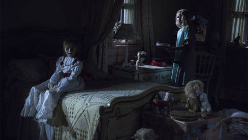
EQUILIBRIUM: A group of orphan children arrive at a ouse in the middle of no where. At first they are very thankful and glad.
DISEQUILIBRIUM: Whist everyone is sleep the main character begins to notice a change as immobile objects are moving. RESOLUTION: The reasoning is identical to our trailer as it is just a trailer and we stuck with the same convention all round 
|

YouTube is a good platform for uploading and consuming. So by us uploading our our media products we have now become the producers and we are delivering to an audience. Youtube is helpful because it's free and allows a mass audience to view and receive the problem.
|
|
As part of our A2 media coursework we had to create a horror teaser trailer which was uploaded onto YouTube which is a promotion for our upcoming film which we are creating in order to promote our up and coming film. We created a poster, magazine and a teaser trailer. After doing a significant amount of research and planning my group and I figured we wanted to create a Slasher however plans changed as we realised the key spontaneous ideas that we came up with leaned towards a more supernatural approach. So following the conventions we gladly included isolated areas, forests and large residential houses. I will be talking about the uses, challenges and the things I developed.
The main conventions vary depending on the genre for example low key lighting which suggests that a dark force is present and evil.I developed this by using the light white equipment which I used and developed by using flash on our phones. I challenged this by only using flash in some shots in my trailer. Another convention i used was the structure of my trailer this link to the Todorov theory which identifies the three main parts of a media text which are normally used in trailers so the starting part has to be slower and create tension and suspense this is typically three to four seconds and towards the end the montage which decreases to 1 second shots which are mainly close ups.
As someone who was not experienced as I did not know about the key conventions that were used similar to AS. however study and research of conventions and subtext. As a result I was able to challenge the subtexts and divert the meanings that real media texts may portray
The last scene made was This then makes the audience eager to know what happens next and want to watch the film.
Length
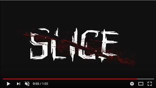
In our trailer we stuck with the typical length of 1 minute in order to carry out this convention and make sure the audience does not get tired or fed up. We have also compared it to other real media text trailers which are regularly between 0.50 seconds to 2 seconds. Our trailer is 1.02 seconds long which is effective as it does not give that much away but enough disequilibrium and interesting shots have been included to provide the audience with pleasure(visceral) in order for them to watch the actual film as the trailer is our promotion product. On the other hand there may be longer trailers as that company feels they need to show more to the audience that wouldn't make the trailer as successful if those shots was left out.
The Conjuring Official UK Trailer (2013)

Our trailer

Animatic Review
|
|
From looking back at my animatic we did not follow the story line as much but we still had the similar ending times.Due to our ability to be free and limited amount of restrictions we were creative and thought of a lot of different and interesting shots to shoot as we were out recording. In addition we were able to change the shots up in order to match the colour scheme using effect cool tone with the use of Final Cut Pro. However the animatic was useful as it helped us with the structure of our trailer the beginning middle and the end and the positioning of shots.
|
Lighting
|
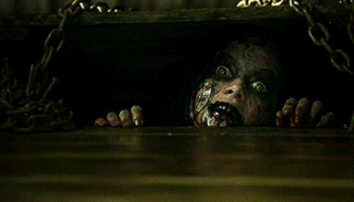
The low key lighting was used as a key convention that most real media texts use in there products to connote darkness, evil and mysteriousness. Low key lighting was often used in our trailer to give the audience the idea that something bad is going to happen really soon. We also used it to suggest that some things are lurking in the mists.
|
This trailer includes low key lighting also. The use of low-key light creates suspense which is the main aim. And as the protagonist is rarely seen it's scary as even as a society we are scared of the unknown.The audience will be on the edge of their seats too because they don't know what is going to happen compared to other genres where dramatic irony is used for a mostly comedic response.
|
Setting
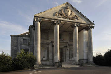
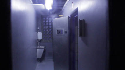
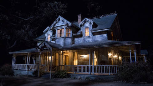
For our trailer we all decided to film in an abandoned house in order to show uneasiness and isolation as he house is supposed to be in the middle of no where so they had no where else to go and if there is no safety point the audience will enjoy the film more disequilibrium meeting their expectations. We did not challenge this because we stuck to our idea and filmed however we also did challenge this because we filmed in a police station too which we did not assume would be incorporated into our trailer. We used a big haunted looking house as real media texts also use this and we have found that this is a typical convention. Of course because most horror films are set abroad(in America) this task was quite hard and we had to go out as a team to try and find houses.
OUR REAL LOCATION
|
|
REAL MEDIA TEXT
|
|
|
Title
|
MY TRAILER
|
REAL MEDIA TEXT
|
|
|
For our trailer we used the conjuring to compare to my trailer in terms of timing (where to place different shots) and finishing times of the trailer. This convention is essential as as promoters we do not want to go over bored and place shots in the trailer that are not essential and we do not want too little. In order to carry out this process and reinforce time conventions we strategically placed shots where need be similar to real media texts. It is important to start with slowly paced shots and start getting faster to imitate the audience/characters heartbeat as what is happening is getting more intense and frightening. In addition to contiue the brand identity we kept the title the same for all products.
Editing
EQUILIBIUM
|
OUR TRAILER EQUILIBRIUM
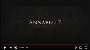
At the start of the trailer we used the same conventions as annabelle as they establish but still have people figuring out whats going on. We started off with calm scenes to ease the audience which is going to turn around and disrupt their peace.Every shot has been edited to make them slower or just to adjust them which made these shots longer to show the contrast between the beginning and the end. Slow shots are often seen in real media texts just to give the foundation story of the trailer in order to give the impression that there is nothing happening and everything is normal. |
|
REAL MEDIA TEXT EQUILIBRIUM
As usual this started of with the shots to establish what is happening. In the trailer which is really slow around three seconds. However the slowness of these shot gives tension so the audience is on the edge of their seats. Each shot has been edited by a professional to give accurate times. |
MONTAGE
|
OUR TRAILER MONTAGE
For the main part of our trailer we used fast cuts in order to make the scenes seem as if they were a heart beat. This is similar to other media texts so I can say that we followed the conventions. Fast cuts in films are often used to lead up to jump scares and change the pace.This also helps to condense space and time and makes the disequilibrium more apparent. |
|
REAL MEDIA TEXT MONTAGE
These montage shots are around 1 second long.They are used towards the end, in order to make the speed of the trailer quicker and increase the speed of the trailer and to portray the violence the conjuring/annabelle creates. This creates suspense in the trailer. |
CONCLUSION
In conclusion, a most of our horror trailer used typical horror trailer conventions to make it more recognisable and we completed this by following and looking at real media texts as we challenged typical conventions in order to draw attention and twist the story and to stand out from other trailers but still follow expected conventions in order to stand out.
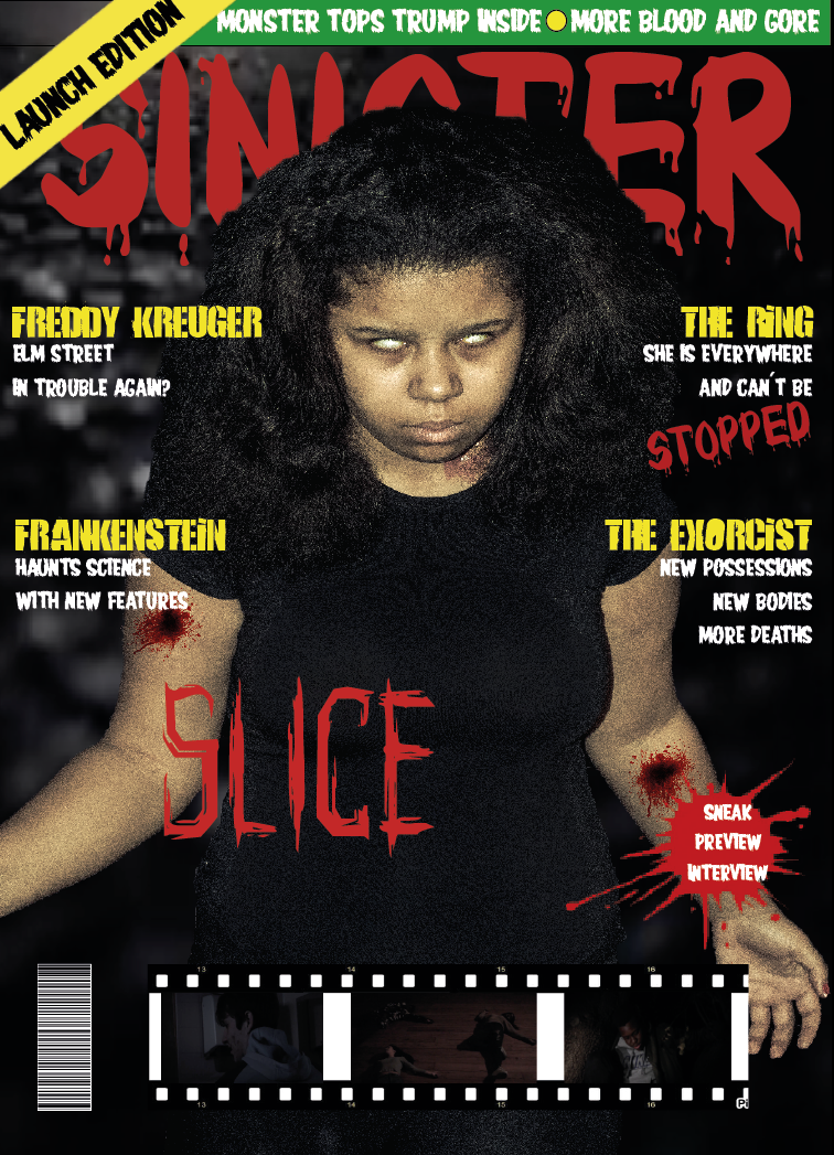
POSTER
By Panashe
Official Poster
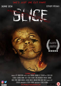
Title
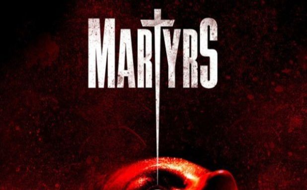
When we created the title of the poster, we realised that it would be one of the most integral parts of our project as it would not only be featured in the poster but also the magazine and trailer. WE had hoped to create a title that was memorable, easy to say and also eye catching and I believe we accomplished that. The graphical element of our title is a cut through the word slice which is obviously referenced from the titular name. There was also a blood splatter added to make it more recognisable as a horror. Conventions were challenged however as the title was put at the top as opposed to the bottom which is typical of horror posters. This was done in order to stand out from other conventional horror posters and to look different from most. We did although, keep a consistent house style as the typography was used all throughout our material. In terms of real media texts, I gained inspiration from the poster of Martyrs but not from the design. I wanted the design of the film to have some sort of connection with the films story, for example, the T in martyrs is shaped as a cross so the audience knows that there are religious themes in the movie. The slice in my title lets the audience know that there is graphic violence and that it is a slasher film.
|
|
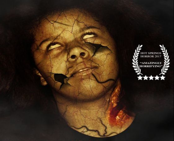
Dominant Image
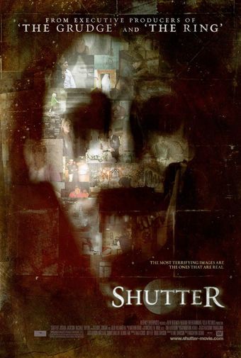
For our dominant image, we followed the typical convention that our poster includes the antagonist of the story. To add, the dominant Image is a close up camera shot of our protagonist so that way they take up a majority of the pace and audiences can get a closer look at all the details of the image that captures their eyes. It also leaves in subtle hints about the films plot and will leave audiences questioning the origin of those veins and scars, this is also known as the enigma code which is a theory by Barthes that suggests that audiences are left ambiguous to the films plot. We developed typical conventions by using dark colours for our colour scheme, as well as adding on different textures to create a much more grotesque and surreal looking image. The real media texts this was based off from the shutter which uses similar ideas in terms of its design and use of texture.
|
|
Billing Block
Another convention that we decided to follow was the use of a billing block. We decided to keep the same typography typically found in other horror posters such as Martyr, to make it recognisable. We used the billing block in our poster to give credits to all the people that were involved in the production of the trailer such as actors/actresses, camera men, writers ect. Most billing boards are structured the same with minimal changes going to be made. There is a consistent theme with horror trailers in how the colour of the text will usually reflect the colour scheme of the main poster, such as the real media text, cabin the woods. However, we challenged that convention by making it white which greatly contrasts the background its laid upon. This draws more attention to it and makes it stand out more.
|
|
Website
We, like many other horror posters included a website link. This was included so that audiences know a place to find additional information regarding the film and its production and anything else they may be interested in. I challenged conventions by including it under the billing board and making it much larger than other bits of information at the bottom. This decision was made in order to make it stand out more. Typical horror posters such as the one from Friday the 13th make it barely visible to see and as a result, audiences maybe unable to find out additional information so we put ours where the date typically is so audiences find it much easier to locate. In addition to this, I made it red and used the same typography as the title to re enforce the previous idea stated.
|
|
Conclusion
In conclusion, a majority of our horror poster used typical horror poster conventions to make it much more recognisable as such and we did this by following and looking at real media texts to derive some inspiration from. Not everything was taken from real media texts as we did challenge typical conventions to stand out from the rest of the horror posters out there.
Magazine - Liz
The media product that I produced is the horror magazine and I believe that it USES conventions of real media products. As someone who initially started the academic year with minimal research and experience of magazine production, it was critical that research was done. As a result of this research, the final outcome of the magazine was at a much higher level than if it was to be produced without knowledge. There are particular conventions that I ensured were similar to professional magazines such as the colour scheme which was carefully picked out to connote certain ideas which related to horror. When comparing magazines of the genre "slasher" and what colours were used, there was a similar pattern where black was the dominant colour, further followed by red and yellow. Further understanding was gained when I realised that these were picked out for reasons i.e. black to represent evil, red to connote violence and yellow to connote deceit. These were all taken into consideration when creating the magazine and I believe allowed the quality of the final product to be of a much higher standard because the creativity and intentions were there.
Another convention taken into consideration (USED) when producing the magazine's front cover is the lighting used for the dominant image. Due to the genre of the magazine being horror, this had to be carefully looked at in order to allow the audience to connote the correct meaning/message behind the magazine i.e. if the image was brightly lit, you can see the character (which in this case was the antagonist which was also intentionally done to show the audience the "frightening character" therefore encouraging them to look inside the magazine and read about the movie) which cancels the ideas of mysteriousness and evilness therefore not having the same effect on the audience if the image was to be dimly lit or even lit in a way which caused a shadow further connoting ideas of mysteriousness.
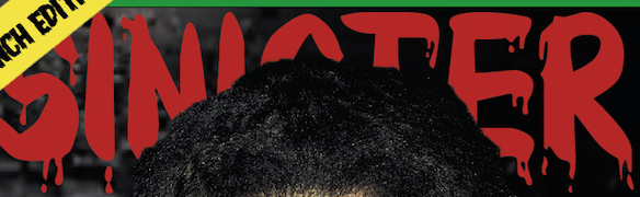
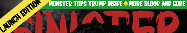
A convention which was CHALLENGED is the font of the masthead. Typically in horror magazines, the font of the masthead represents aspects of horror i.e. may denote imagery of broken bricks which could represent the character on the front cover's past or even perhaps blood dripping from the font to connote violence and therefore represent the genre the magazine is on. Even the colour of the masthead is typically red connoting blood and violence or yellow connoting deceit and if in some cases the font is white, the font denotes bloody imagery therefore still connoting the ideas horror magazines aim to show the audience. Despite research done into this, I decided to CHALLENGE the typical colour and font of the masthead and chose a more sophisticated looking font and make it white to emphasise the professionalism of the magazine.
Another convention taken into consideration (USED) when producing the magazine's front cover is the lighting used for the dominant image. Due to the genre of the magazine being horror, this had to be carefully looked at in order to allow the audience to connote the correct meaning/message behind the magazine i.e. if the image was brightly lit, you can see the character (which in this case was the antagonist which was also intentionally done to show the audience the "frightening character" therefore encouraging them to look inside the magazine and read about the movie) which cancels the ideas of mysteriousness and evilness therefore not having the same effect on the audience if the image was to be dimly lit or even lit in a way which caused a shadow further connoting ideas of mysteriousness.
A convention which was CHALLENGED is the font of the masthead. Typically in horror magazines, the font of the masthead represents aspects of horror i.e. may denote imagery of broken bricks which could represent the character on the front cover's past or even perhaps blood dripping from the font to connote violence and therefore represent the genre the magazine is on. Even the colour of the masthead is typically red connoting blood and violence or yellow connoting deceit and if in some cases the font is white, the font denotes bloody imagery therefore still connoting the ideas horror magazines aim to show the audience. Despite research done into this, I decided to CHALLENGE the typical colour and font of the masthead and chose a more sophisticated looking font and make it white to emphasise the professionalism of the magazine.
Masthead
|
|
A typical convention found on horror magazines is the masthead. The masthead is a piece of text typically found on the top of the magazine's front cover. It is always the largest text as it's used to grab the audience's attention to the name of the company that owns the magazine. This is useful because if the company is well known and already has an audience, they will almost immediately grab the magazine due to their previous good experiences with the company. However, similarly on the contrary, if the company isn't well known and someone selects the magazine to read and they like it, then for future references they will read/purchase the magazine and even refer people to it. The masthead is usually bold and colourful which further grabs attention. However if font colour is white, then it's usually because the magazine is already colourful and therefore by making it white, it still stands out therefore reaching its objective of standing out on the front cover. The font is also typically associated with a horror theme e.g. the font could resemble blood dripping or perhaps be shaped sharply to resemble a knife.
For our magazine, I USED these typical conventions so the audience would be able to familiarise themselves with what genre the magazine is. It's more suitable to use the font and I chose the white font colour as the black was used on the dominant image to further suit the horror theme as it connotes ideas of mystery and evilness. Furthermore, through research, I concluded that quite a few mastheads aren't necessarily fully shown on the page and can be hidden by the character in the dominant image as shown on our front cover.
*UPDATE: Just realised that the font used for the official magazine is the same as our horror magazine's!
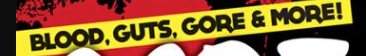
Sell Line
|
|
The sell line of a magazine is also typically found on the top of the magazine, sometimes even above masthead although not as significant as that convention. It is used to attract the audience's attention as it shows off what the magazine has to offer (a way of enticing them). A block colour put behind it also a popular convention as it not only stands out more, but adds colour to the front cover. The colours do also tend to be bright which draws the audience's attention to it. The colours used are also part of the colour scheme of the magazine, to avoid too much colour on the front cover as that can distract the audience too much from the important information/context of magazine.
For our magazine I DEVELOPED the idea of the sell line slightly by changing the typically black font to a white one as it suited the colour placement and still fulfilled its purpose of standing out and drawing attention.
For our magazine I DEVELOPED the idea of the sell line slightly by changing the typically black font to a white one as it suited the colour placement and still fulfilled its purpose of standing out and drawing attention.
Graphical Element
|
|
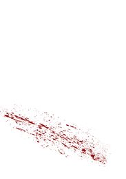
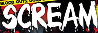
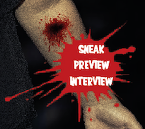
Another typical convention found on horror magazines are graphical elements. These are used for aesthetic purposes where a shape is placed on the front cover to suit the genre of the magazine. In this case, the genre is horror therefore the suitable graphical element is blood splatter. The text placed on the top of it is text that can further draw the audience attention or perhaps a strap line.
For our magazine, i USED the convention as it was suitable for my front cover. The blood added effect to the front cover aand allowed it to look more interesting. The colour red also represents blood which is a feature found in the horror genre.
For our magazine, i USED the convention as it was suitable for my front cover. The blood added effect to the front cover aand allowed it to look more interesting. The colour red also represents blood which is a feature found in the horror genre.
