|
Done by panashe
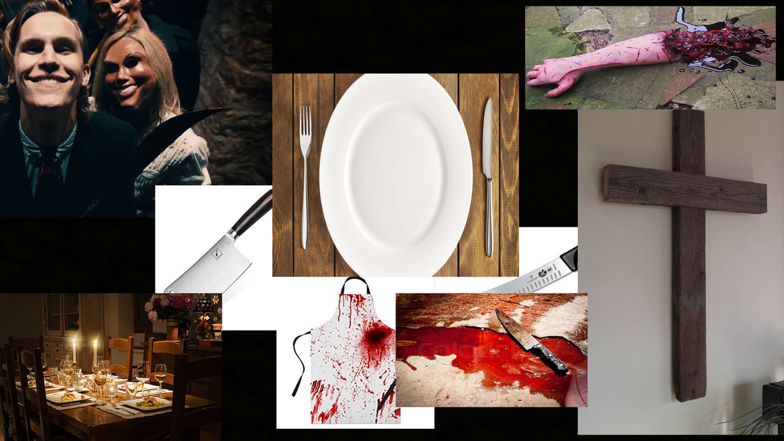
This is the moodboard for the Prop Design of our film. Notice the use of various knives which are the weapons for the main antagonist. The antagonist will mainly use sharp objects as a form of killings as she likes to get very close and personal with her prey. There is also a man making a very scary face and a girl with a mask which shows how he may be good looking but is giving off a creepy vibe. The mask is meant to represent a hidden identity which is where the main ideology of the film stems from. There is a cross which of course is religious symbolism and there are also severed arms which are what the antagonist will be collecting.
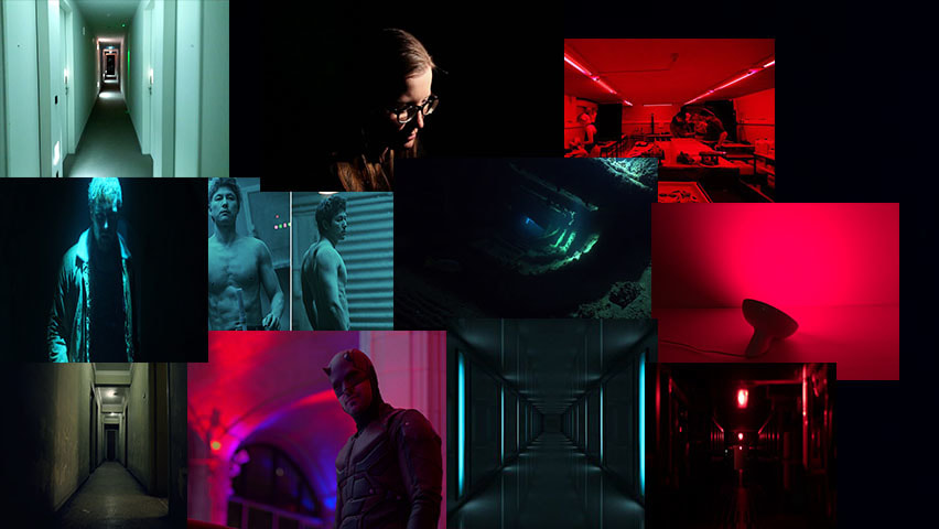
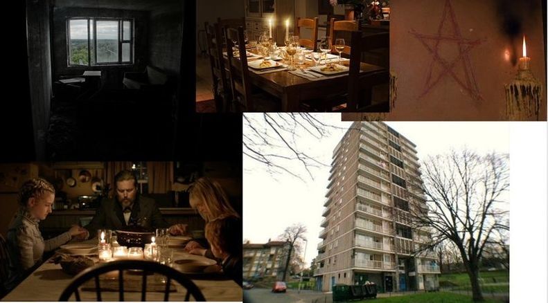
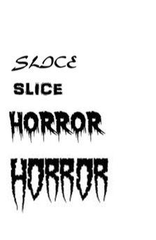
This is the colour mood board and this is meant to show off the various colour schemes that we will be using in our trailer, poster and magazine, of which was chosen by our audience through our research. Notice the use of Erie greens and vibrant reds which are meant to convey two different tones. The green is meant to give off a sense of disturbance, a sense of creepiness and unease. This is what will be used when the antagonist is not killing and the mystery is being set. The vibrant reds are meant to connote death, violence, danger and passion. This will be used during the scenes that the antagonist is killing the main cast or when they are in hot pursuit. She is very violent and takes passion in her violent acts so this is why i felt that red was a good colour of choice. This is the location mood board for our trailer. As you can see, it takes place in an a mere apartment complex and whilst this is may seem mundane, the reason behind it is because it acts as a home invasion trailer. Notice the use of low key lighting in most of the images such as the dinner table and the room with the pentagram. This is meant to convey an ambient and eerie mood within the trailer despite its unconventional setting. This is the typography for the trailer. The first trailer is very cursive and seems light. This could be a possible title for the Poster. The 2nd one is very bold and filled out. It has small spikes poking out from all sides. The 3rd one does the same thing except the writing is less bold and more curvy much like the first one. It gives off the feeling of blood dripping from it which is very appropriate for the sub genre. The final one incorporates rough and jagged edges and long thin line work. |
|

