
Research collected by panashe
Trailer Questions
Trailer Results
100% of the people who voted said that the name "Slice" fit the description of the horror trailer. This tells us that the audience would be able to get a rough idea of the films sub genre and that the name of the film is important
57% of our audience said that a teaser trailer would be more effective than a theatrical trailer. This tells us that most of our audience would rather be left surprised and do not expect too many details in the trailer and that shorter is better
71% said that they would like to see death in their trailers and this tells us that we should ensure that our death scenes are at a very high standard
100% of our audience said that jump scares would be effective in our trailer and from this we can infer that audiences like to feel physically scared, which means that our editing, camera and various other conventions must be effective in order to give our audience that visceral pleasure
57% said that a fast paced trailer would be more effective than a slow paced one but the results were fairly close so instead we will start off slow paced and build it up to the quickly paced scenes near the end
Once again, 57% said that a resolution would be better than having none at all. This is actually a typical of horror films as of late but due to the results being fairly close, we will show some semblance of a resolution through things such as character deaths but not a full on ending as there may not be enough time for that and it may not fit the tone of the film
85% of the audience said that gore would be effective in our trailer so as a result, we will make sure that our special effects and make up and and design are of a high standard in order to meet audience expectations.
57% said that dialogue should be just as prominent as action whilst 43% said that it shouldn't. Since this is fairly split, instead we will have a balance of action and dialogue in the trailer where necessary.
57% of the audience decided that a black, red and dark green colour scheme would be effective and us film makers also agree. This colour palette would help convey the different moods and tones that we want to represent in the film, such as violence, death and suspense.
85% of the audience decided that they wanted a cliff hanger ending in the trailer. This tells us as film makers that audiences do like to be kept surprised and in suspense of what is happening in the film.
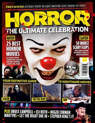
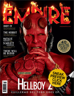
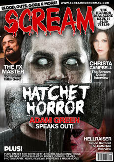
Magazine Questions:
1. Which colour scheme would you like to see?
|
|
2. Should the Masthead have a similar design as the movie title?
3. Should the design be minimal or detailed?
3. Should the design be minimal or detailed?
|
|
3. Should the design be minimal or detailed?
4. How many cover lines should be shown? (1-4)
5. Should the image show direct address to the audience?
4. How many cover lines should be shown? (1-4)
5. Should the image show direct address to the audience?
|
|
6. Should the magazine feature a strap line?
7. Should the front cover have films of the same sub genre on it?
8. Should more than 1 image feature on the page?
9. Should the page be designed around the image or vice versa?
7. Should the front cover have films of the same sub genre on it?
8. Should more than 1 image feature on the page?
9. Should the page be designed around the image or vice versa?
|
|
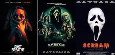
Poster Questions:
1. Should the poster be dark or bright?
2. Would rather the whole cast, antagonist or protagonist be on the poster?
3. Should the poster be ambiguous in what the movie is about?
1. Should the poster be dark or bright?
2. Would rather the whole cast, antagonist or protagonist be on the poster?
3. Should the poster be ambiguous in what the movie is about?
4. Should it be simple in design or detailed?
|
|
5. Should any characters be present?
6. Should the antagonist's prop be present?
6. Should the antagonist's prop be present?
7. Should death be present?
8. What form of lighting do you prefer? Light or Dark?
9. Should the title be on the poster?
10. Should a tagline be included?
POSTER AND MAGAZINE RESULTS
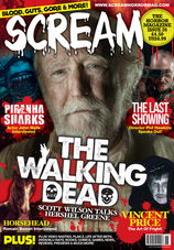
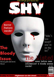
In conclusion, the most chosen colour scheme for the magazine said it should have a red colour scheme, most likely to fit the red colour scheme for the trailer. Most also agreed that the masthead should be similar in design as the movie title. The magazine will be designed around the image as opposed to the text and will also be detailed in design.
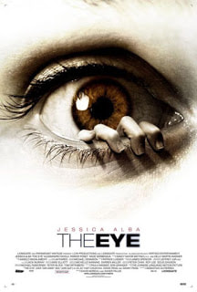
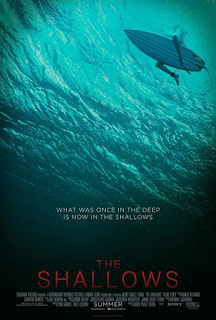
50% said that the antagonist and protagonist should be on the poster so we decided that we shall include both of them in order to satisfy both audiences. The movie title will be included on the poster and the antagonists prop will be included on the poster. 50% said that the poster should be ambiguous and 50% said that it shouldn't so instead, we will decide to not make it ambiguous as to what it's about. Most also said that death should be present so we will include a character death somewhere in the poster.
50% said that the antagonist and protagonist should be on the poster so we decided that we shall include both of them in order to satisfy both audiences. The movie title will be included on the poster and the antagonists prop will be included on the poster. 50% said that the poster should be ambiguous and 50% said that it shouldn't so instead, we will decide to not make it ambiguous as to what it's about. Most also said that death should be present so we will include a character death somewhere in the poster.
