
INTRODUCTION
In this section we will be showing our film 'slice' over a various media formats as well as inspirations from other texts such as insidious. We will be looking at horror film continuity as we have realised that many horror films have sequels which is put in place. In addition we will be identifying synergy which is highly used. We will also look at the use of cross media convergence meaning combining two or more mediums for example TV and film for example sky may be working with the producers of a film to broadcast it and draw a bigger audience so spend money on the film. Convergence in general covers the internet, animation, smartphone technology, music, DVD, video game consoles and TV. By using cross media convergence it gives your film a strong brand so it is recognisable to the fans of the film or even the fan base if the film is successful and has been made iconic.An effective way of carrying this out is to produce franchise of our film 'slice' and how we can distribute it similarly to real media texts.
Synergy is described as the combination of two or more products which together combine to create a greater force than if they were standing alone. The title The obvious factor. Our main product and ancillary texts all link together by the name of our film, our brand 'Slice'.
BY ESTHER FATUNLA
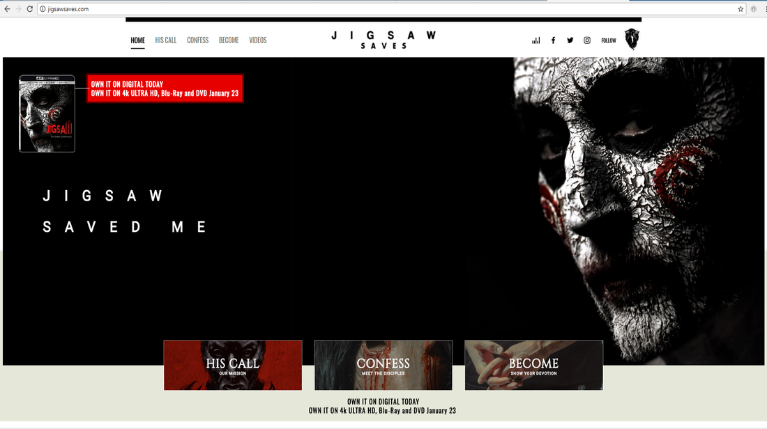
EXAMPLES OF REAL MEDIA TEXTS
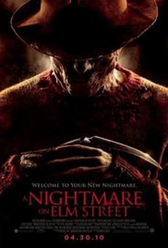
NIGHTMARE ON ELM STREET BY ESTHER
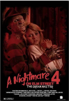
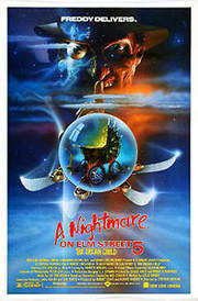
The nightmare on elm street is an extremely successful franchise and a recognisable horror film. It was distributed by New Line Cinema and released on November 9 1984.It was produced by New Line Camera, Media Home Entertainment and Smart Egg Pictures.There are currently 8 nightmare on elm street movies. The Nightmare on Elms street franchise has grossed a total of 82,622,655 worldwide with a combined budget of 1.8 million USD.
|

|
|
|
|
|
|
|
|
|
|
|
|
|
|
|
|
|
|
|
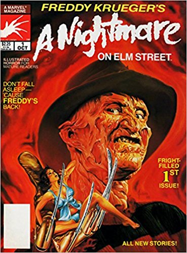
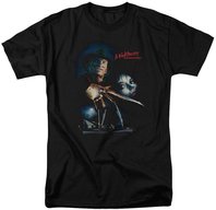
The Nightmare franchise has managed to maintain a consistent house style in terms of the conventions used in the trailer and posters to establish the brand name. Each trailer and poster used has kept the same colours, font and characters. Colours From looking at the trailer the colours (which are cool tones used to connote uneasiness and evil) are identical. Having the same colours is vital it also includes extremely limited use of the colour red which connotes blood death and danger, this also sticks out and attracts the viewers. The font used in the trailer is the same as the poster. The continuity (meaning the maintenance of continuous action and self-consistent detail in the various scenes of a film or broadcast) between the different platforms is essential so the brand can give itself brand identity so there is clarity and it makes the media texts easily recognisable to those fans of the same genre.The typical characters used are included for iconography purposes as Freddy Kruger.
Brand Identity
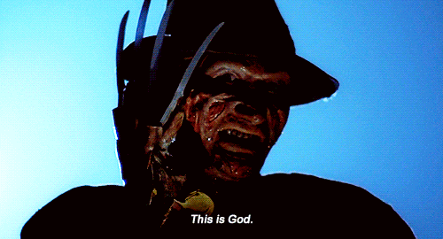
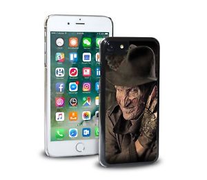
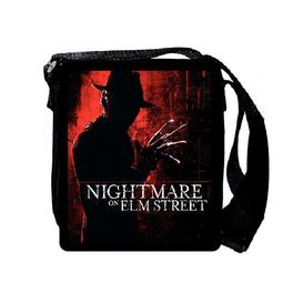
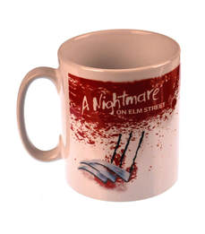
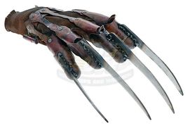
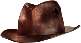
Some of these items are logos, tagline and shapes that stand out and are used repeatedly. Also the consistent message received by it's audience to ensure they are marketing to their audience/consumers.As shown Freddy Kruger has a bloody mask which makes him look ugly. He has a brown old hat, claws and a stripy top these are all key conventions used to identify the Nightmare on Elms Street film. Brand identity allows them to stand out from any other brands and make the production more appealing to your audience. A companies brand identity can either lead to success or downfall.
Other Forms of Media
|
|
|
|
Due to Nightmare on Elms street being successful they continue through other forms of media in order to widen their fan base. They have one game with NES game play which stands for Nintendo Entertainment System which is a home video console that was developed and manufactured by Nintendo. There are no other games on X Xbox or PlayStation and the PC which were the latest video game consoles. All these games seem to have identical typography which establishes the brand and makes the game player/voyeur recognise the film. Due to of the consistent colour scheme of the promotional material is noticeable through the audience. This shows Nightmare on Elms Street are successful as they are making money out of their franchise through cross media convergence.
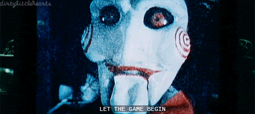
This is a trailer made by the consumers of the nightmare in elms street horror night because the franchise had been successful. So they created a horror attraction which is supposed to continue the brand and create brand identity which will draw a bigger audience and the company will gain more fans. In addition the typical iconography has been included so the audience can identify with the film even though this is a attraction so it is recognisable. For example the audience walk through and there are white sheets in front of them so what happens next is a surprise, as the audience has gone their for entertainment which is good because it benefits them as they are receiving emotional pleasure and getting what they paid for a the company is getting the money. Examples of some key iconography would be Freddy Kruger propped with his claws and mask and the scenery is similar.
|
|
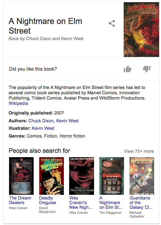
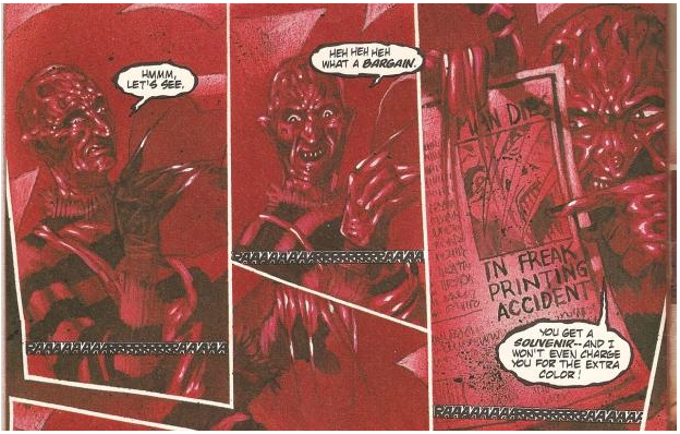
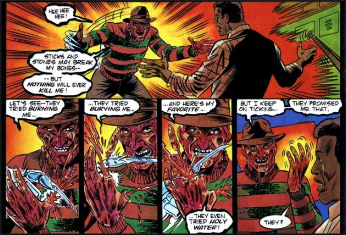
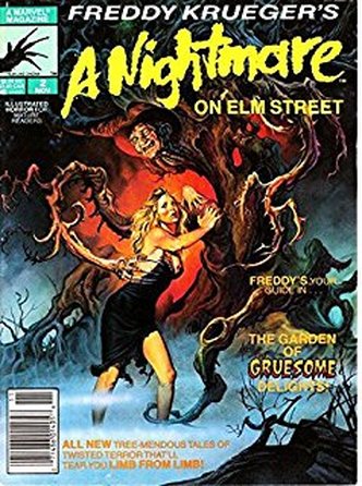
Comic books were also created due to the film being successful and this is helpful as the audience will be able to recognise the film through certain iconography used. This is used to expose their product. In this case the writing and any other text is usually imitated by text font and colours. By this the audience can easily recognise and trace where exactly/which film the comic book is imitating.
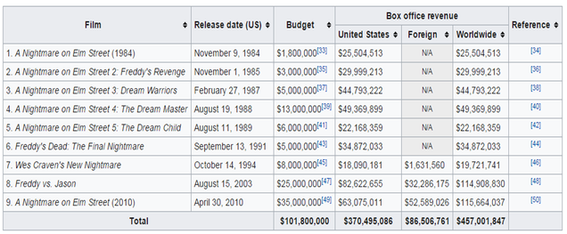
The image above is the gross for the film Nightmare on Elms Street which started in 1884 and there most recent film was in 2010. Also the overall gross in the US individually and overall. For a film to be successful it needs to make at least two times its budget to ensure that they get a profit because if they just get the same amount of money back it does not benefit them and they would have been better off not making the film in the first place because they not only didn't get profit it was a waste of time when they could have been busy making a more successful film. The Nightmare on Elms Street franchise has clearly been successful as have made 370,495,086 when there budget was 101,800,000. Due to their success they have created many films/sequels. Also they started selling merchandise which is vital for producers as it enables the audience too see it in there day to day lives or interact with it. This brings in more profit as most likely the audience will go back to the cinema to watch this successful film again. The merchandise will be recognisable as it uses the key iconography form the film . The merchandise will be largely promoted because it has a synergistic relationship with other companies.
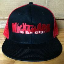
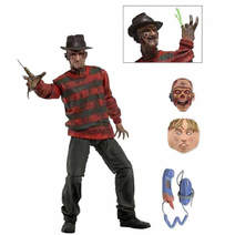
MERCHANDISE
|
|
|
|
|
|
|
|
- ESTHER FATUNLA
By Panashe Sibanda
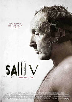
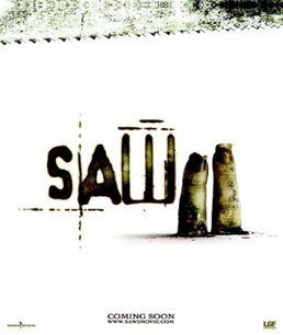
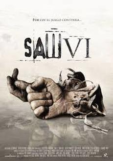
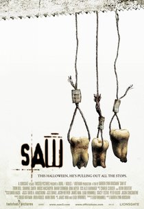
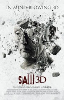
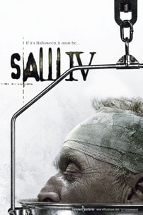
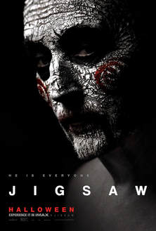
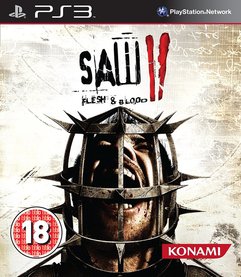
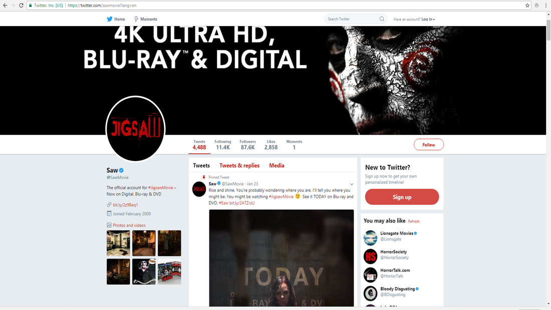
The SAW franchise is one of the most successful and recognisable horror franchise in film. It was distributed by Lionsgate, produced by Twisted Pictures and created by James Wan and Leigh Whannel. There are currently 8 saw movies, 2 video games, 1 short film, a one shot comic book, 11 soundtracks for its films and plenty of merchandise such as toys and clothing. The Saw franchise has grossed a total of $975,375,381 worldwide with a combined budget of $77 million with all its films together. Its use of synergy and cross-media convergence with companies such as Thorpe park and universal studios for example has definitely contributed to its worldwide success over the years.
|
|
|
|
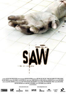
The saw franchise has kept a consistent house style in terms of the conventions used in their promotional material, particularly their posters with one exception. They all share the signature white background with the same typography shared across all posters. They also have a different body part for each film. The final film jigsaw is an exception and has a completely different colour palette, typography and even style of image. This tells the audience that this movie is structured differently from the previous films and its new approach of being a story centred solely around the antagonist.
Saw Brand Identity
|
|
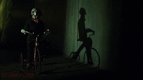
In terms of Saw, the iconic character for their brand identity is in fact Jigsaw who is also the antagonist of the stories. His iconic character design, constant appearances in the films and everlasting impression on the audience is what has made him such an iconic character and an integral part of their brand identity
Other Forms of Media

|
|
With a successful franchise such as saw, it only makes sense that they continue their continuity through other forms of media. They created two video games. Saw: The Video Game and Saw II: Flesh and Blood for the PlayStation 3, Xbox 360 and the PC, which were the latest video game consoles at the time. They also use the same typography and colour scheme as the promotional material for their movies to make it very recognisable. This shows that their branding of their franchise and use of cross media convergence has been successful. The games themselves got mixed reviews but a majority claiming that it is a good experience for fans of the franchise, many praising its storyline, references to the original films and key ideas.
|
|
|
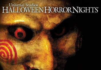
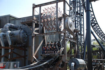
In the success of the franchise, they joined with Thorpe park whilst the films were still being produced to create a new attraction called Saw: The Ride which is a saw themed rollercoaster which opened March 13th 2009, which happened to be on Friday the 13th. It of course has saws as its central theme which shows successful branding. They also collaborated with universal to create what they called Saw: Game Over which was a maze based on characters, traps and scenes from the films for Halloween horror nights, is an annual halloween themed special event that occurs at Universal Studios Florida. It features haunted houses, "scare zones", and live entertainment – many of which use Universal Studios' characters including traps and characters from the Saw franchise.
|
|
|
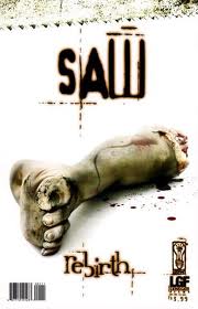
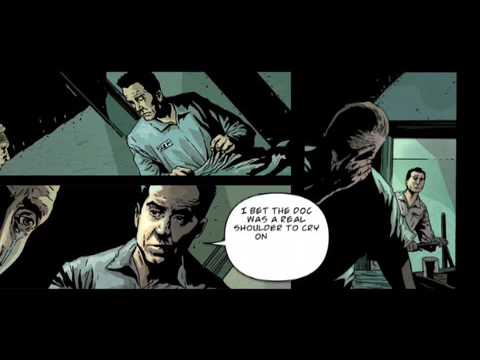
Saw: Rebirth is a digital comic book. It was written by R. Eric Lieb and Kris Oprisko with art by Renato Guedes. The comic serves as a prequel to the first Saw film as well as the Saw franchise as a whole and focuses on the early life of John Kramer and the events that eventually made him become the infamous Jigsaw Killer. The creation of this comic really shows the success of the franchise as a whole as it is further adding to the Saw lore but through another form of media which will attract the comic demographic.
|
|
|
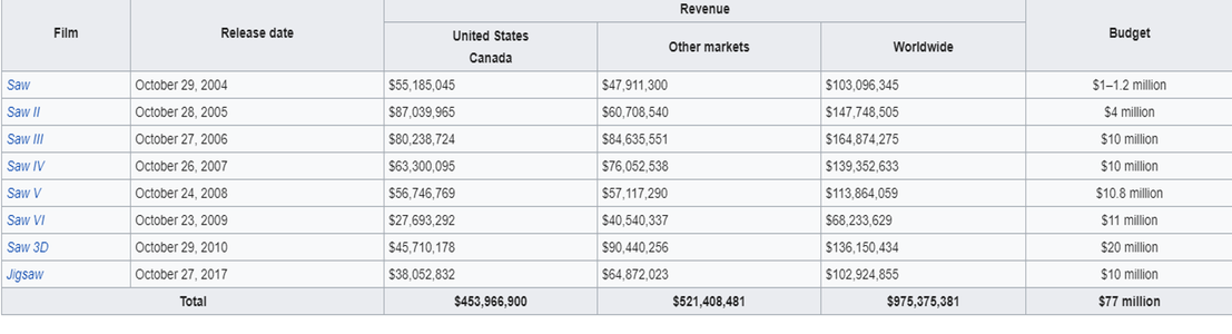
Above is the gross that each Saw film has made since they began in 2004, leading up to their latest spin off film in 2017, Jigsaw as well as the budget of each film. It also shows the overall gross of every film in the US, worldwide and other markets accumulated over the years. A film needs to make at least double their budget to ensure that they earn a profit and also for it to be considered as successful. The saw franchise has evidently been a financial as they have made nearly 1 billion dollars from their films alone. Their worldwide success is also the reason for the large amount of sequels. Selling merchandise is a factor that contributes in how much the producers make. Merchandising is very important for producers as it keeps the film in the audiences mind long after they’ve left the cinema and watched the film. This makes the film more profitable as the audience member may be more likely to return to the cinema to see a later instalment in the film franchise as well as turning the film into a platform to sell merchandise for its profit. As shown in the slideshow on the left they sell things such as phone accessories, posters, t-shirts, toys of the most recognisable characters which is clearly jigsaw and much more. The merchandise will be highly promoted because it is working in synergy with the film. They even have a website to promote their latest film which of course viewers can engage themselves in the lore of the franchise as well as find out additional information from their other social media links.
|
|
|
ICONAGRAPHY
Trailer + Poster:
|
Trailer
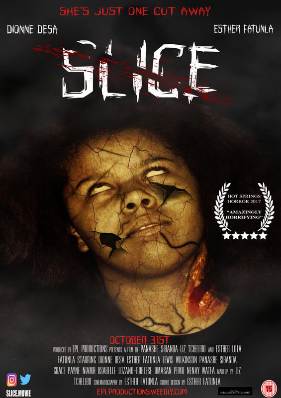
FONTS: The fonts used on the trailer are identical to the poster.The same font of "Slice". This is important as the audience will be able to recognise fonts and it will be easily identifiable as it continues our brand identity. In addition it will be good for a successful franchise and consistent house style.
COLOUR SCHEME: Uses cool tones (blue) as well as red tones, this could be used to show how everything was calm but now that Freddy Kruger is around there is danger and the red colours are used in the magazine because Freddy Kruger is present and he is the monster who has come to cause havoc. CHARACTERS: The trailer and poster focus on the antagonist which is why he is the dominant image.This character has been propped to scare the audience and so the audience is familiar (seen as this is the films iconographic character). In addition Freddy Kruger does not look like the average human so it draws the audiences attention. However the story line has not been given away making this successful. |
Poster
|
ESTHER FATUNLA
Trailer + Magazine:
|
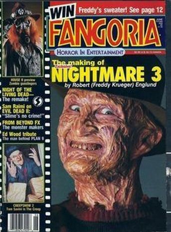
FONTS: The fonts used are not the exact same but this is only because the magazine is almost a cartoon and the fonts are exaggerated.
COLOUR SCHEME: The colour scheme has been kept the same the cool tones are consistent however in the magazine included bright tones(yellow) to draw attention towards the important titles and texts. CHARACTERS: The Freddie Kruger is used as key iconography to draw the audience in and is the films brand identity and what the audience identifies with. |
|
BY ESTHER FATUNLA
OUR PRODUCT
|
FONT: Similar to the real media texts the title does not have the same type font as the trailer or poster however the title with the correct font was placed in the middle
COLOUR SCHEME:The colour scheme has been kept the same however similar to the real media texts included bright tones(yellow) which are not part of the colour scheme but connote danger and used to draw attention however the main colours that continue our brand identity (red and black). CHARACTER: The character has been kept the same in all three products, the trailer, the poster and magazine. This ensures continuity and brand identity is consistent. This is related to our trailer as well because she is the main character. |
|
OUR PRODUCT
|
FONT: The font and title on the poster is exactly the same as the font and title on the trailer. Both the titles are white with a slash of red which relates to it being a slasher and also connotes that there are impurities and signifies danger and a warning which is a key convention of horror films. Just like our real media text above the the main characters on the poster and is the main character in the trailer as well.
COLOUR SCHEME: The colour scheme has been kept the same in both the trailer and the poster including blood and use of low key lighting. CHARACTERS: The characters are kept the same so this is our brand identity. |
|
BY ESTHER FATUNLA
OUR PRODUCTS
By Panashe Sibanda
BRAND IDENTITY:

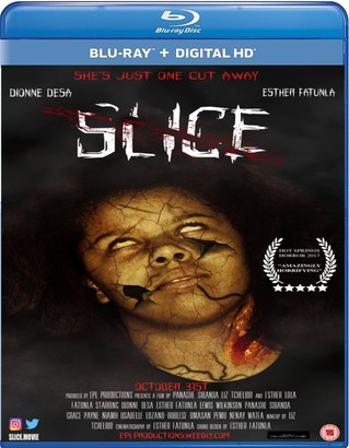
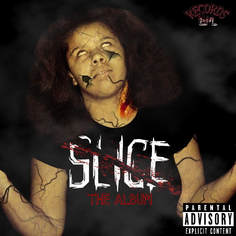
Brand Identity is a very important part of how a company makes itself recognisable to its core audience. Our logo is EPL Productions and is featured on all of our products and media. It is on our poster, our trailer and our magazine and creates a shared continuity. The font is in comic sans and is coloured white, albeit with red streaks flowing down to appear like blood, just to make it recognisable as a horror studio. The title for our film features similar attributes as the font is very jagged and rough, with a large cut splitting through the middle of the text, which links with the name "Slice". There are also dashes of blood that is splitting through that cut.
DISTRIBUTION COMPANIES:
|
|
|
EPL Distribution is a subsidiary of the EPL Company and EPL Distribution's primary focus is on the distribution of our films and other forms of content to different media outlets such as the cinema or other streaming services such as Netflix, Hulu or Amazon. We have been able to distribute our content to different media platforms through cross media convergence and this has allowed us to reach to a larger audience that extends past the cinema.
|
TELEVISION COMPANIES:
|
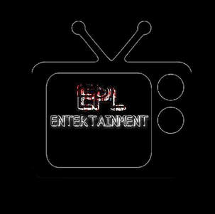
|
EPL Entertainment is our second subsidiary and another way to gain profit for our conglomerate EPL Company. EPL Entertainment focuses on the production of our television programs and distribution of it onto other channels and networks such as Sky and Virgin Media. This is used to present behind the scene featurettes and spin off TV shows for our films. |
RECORD LABELS:
|
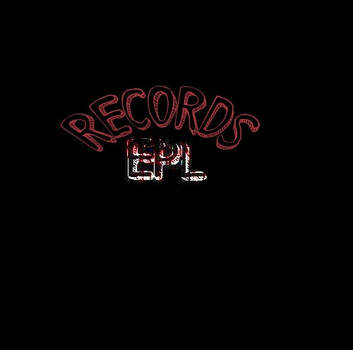
|
EPL Records is another subsidiary that focuses on the production and distribution of any musical records and soundtracks for our films and TV shows. EPL Records is where SLICE: The Album was recorded and produced. EPL RECORDS distributes audio content to streaming services such as Apple Music so that our audience are able to consume our content on their digital devices. We have also mass produced physical copies of the Slice Album via CD's which are available for purchase. This makes use of synergy as by marketing the brand of the film, we will also be generating interest in the other media products. |
GAMING COMPANIES:
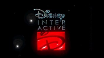
|
|
EPL Interactive is the subsidiary that focuses on production and distribution of any video/computer games. They created Slice the video game for the PS4 and Xbox One and worked in collaboration with EPL Productions to help create it as it uses characters and themes from the films. This use of synergy increases profit sales for both media platforms in general. We are also appealing to the portion of our fan base that plays video games which then increases the range of our audience |
COMIC BOOK COMAPANIES:
|

|
EPL Publishing is the subsidiary of EPL Company that publishes graphic novels and comic books. It was created and formed by Esther Fatunla who is also a key illustrator for our most popular comic book series Slice: The Comic. This use of synergy allows us to attract the demographic that enjoys graphic novels and comic books, which will then lead to more revenue for our company.
|
Synergy Through Other Media Platforms
DVD's/Games:
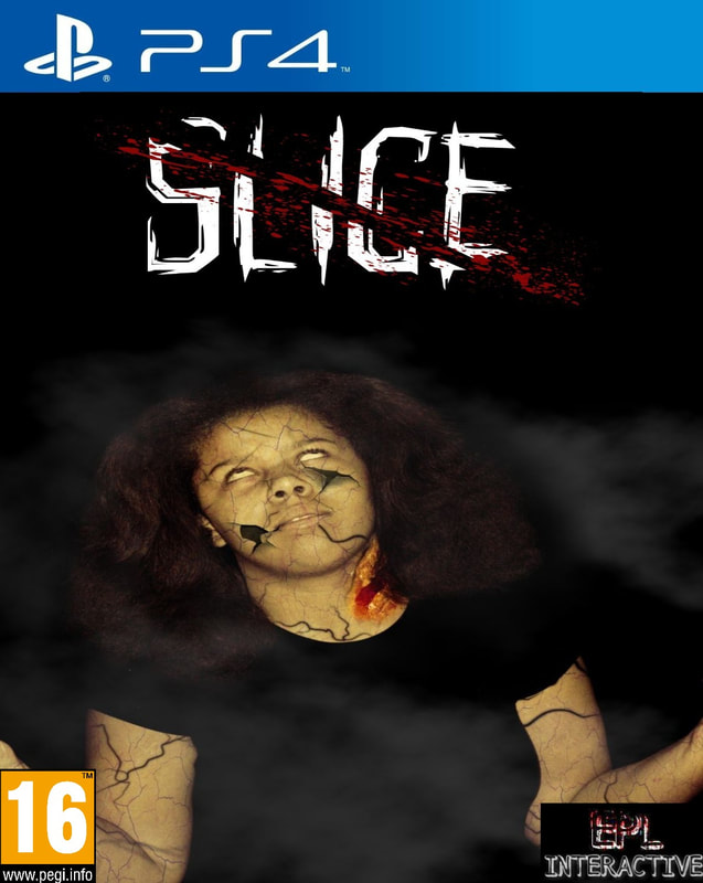
|
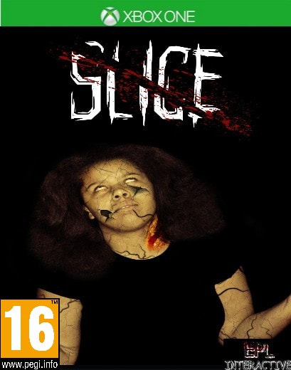
|
We created a video based on the movie Slice which shares the same title of the movie. This is game features characters and themes from the movie, but it is standalone so anyone that hasn't seen the film can enjoy just as much as the people that have. This makes it more accessible to other people and increases the amount of people that want to play the game. The game was released on two of the most popular gaming consoles that most people possible own. The age rating for the games also remained the same as the movie so that way we are still keeping the core audience that appealed to the film.
|
|
Slice was released on Blu ray disk so it can be viewed from home or on any Blu ray compatible device. This allows us to appeal to the demographic of people that are trying to view the movie from their house but with more than five times the storage capacity of normal DVD's, and an unprecedented HD experience. |
|
|
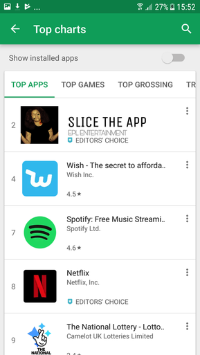
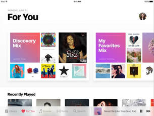
Here is a screenshot of the androids Play Store showcasing Slice The App, which was produced by subsidiary EPL entertainment. The app will allow users to watch behind the scenes footage, read up on interesting trivia involving the movie as well as a forum in which fans of the film can discuss anything about the lore, post theories and make reviews. This allows us to extend our interactivity with audience as well as allowing them to stay invested in the film long after they've seen it. |
Advertisements:
We also created a
|
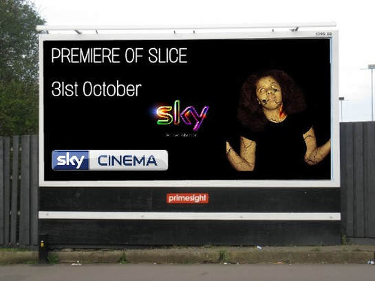
We have created a large billboard to be shown on the sidewalk to promote the film Slice. EPL Productions has been working in collaboration with SKY to promote the premiere of the film on their channel Sky Cinema. The film will be presented on 31st of October which will also be the 1 year anniversary of the films theatrical release in the cinema and also the date of Halloween. We got a relatively large billboard so it increases the chance of passerby's seeing the film. The background of the poster was also made black so I could keep with the same theme of darkness and horror. ESTHER FATUNLA
|
TV/Websites
|
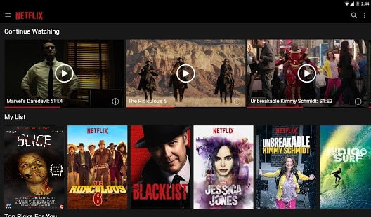
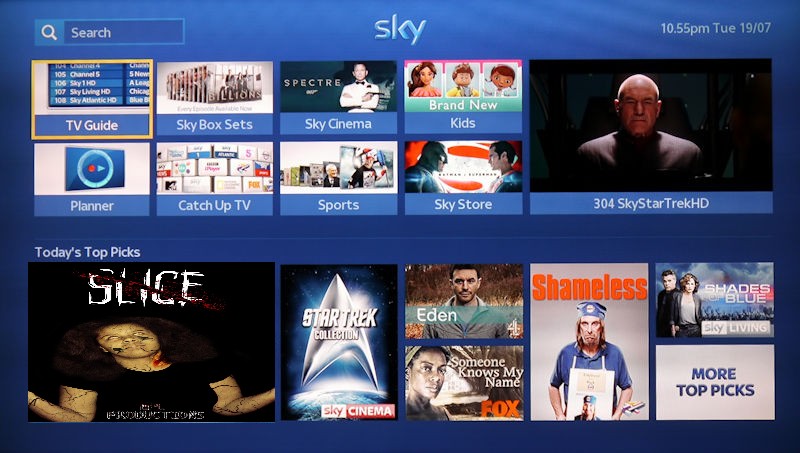
We have worked in collaboration with SKY to present our film on SKY premiere, which we also advertised on our billboard. The movie will premiere on the 31st of october, acting as a 1 year anniversary of the films release, whilst also being released on halloween. There is also a screenshot of the Slice movie being shown on the online Netflix homepage. Netflix is a subscription-based movie and television show rental service that offers media to subscribers via Internet streaming. Netflix is an extremely popular streaming service so that increases audiences chances of seeing the movie, it also acts as way for them to view it on different devices which is an example of synergy and cross media convergance
|
|
|
|
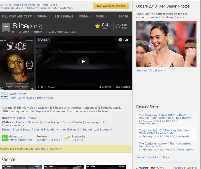
This is a screenshot of the films IMDB page which is an online database of information related to films, television programs and video games that happens to be one of the most used and reliable sources on movie, television and video game information on the internet. Here there is a synopsis of the film telling readers what it is about, as well as giving any additional details on the movie such as the age rating, release date, the creators and much more. Our final poster is also included on the page as well as a YouTube link to our trailer.
|
|
Other Forms Of Media:
|
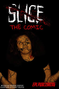
A comic book version of the Slice film was released and it acts as a prequel to the events of the film, detailing the life of the antagonist before her descent into insanity. It was written by the same person who wrote the story to the film and illustrated by one of the films key producers. EPL Publishing is the subsidiary company that produced this comic. Comic Books and Films do not always share the same consistent house style as an attempt to look standalone, however EPL Publishing decided to keep the theme consistent in order to keep in with our brand identity so as to show our audience that we are a part of the same continuity and to look recognisable. |
|
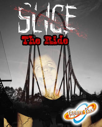
This is the poster for the Slice The Ride in which we are working in collaboration with Thorpe Park to create. The ride will have an October release date to fit with the theme of Halloween and will feature scares and themes relating to the film, including a hologram of the films main antagonist. This use of synergy with Thorpe Park is a good way of promoting the film further. The poster also uses the same image as the one used in our main theatrical poster which shows a good sense of continuity. |
|
|
|
EPL Records produced and created the soundtrack/album for the Slice film called Slice: The Album. The album features songs shown within the film, plus a variety of scores which was all produced by one of the most iconic composers in the film industry, James Horner who previously worked on films such as Avatar, Titanic and Aliens. The soundtrack is available on streaming services such as apple music which shows a good use of synergy with the company.
|
|
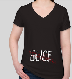
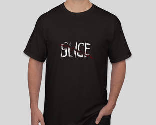
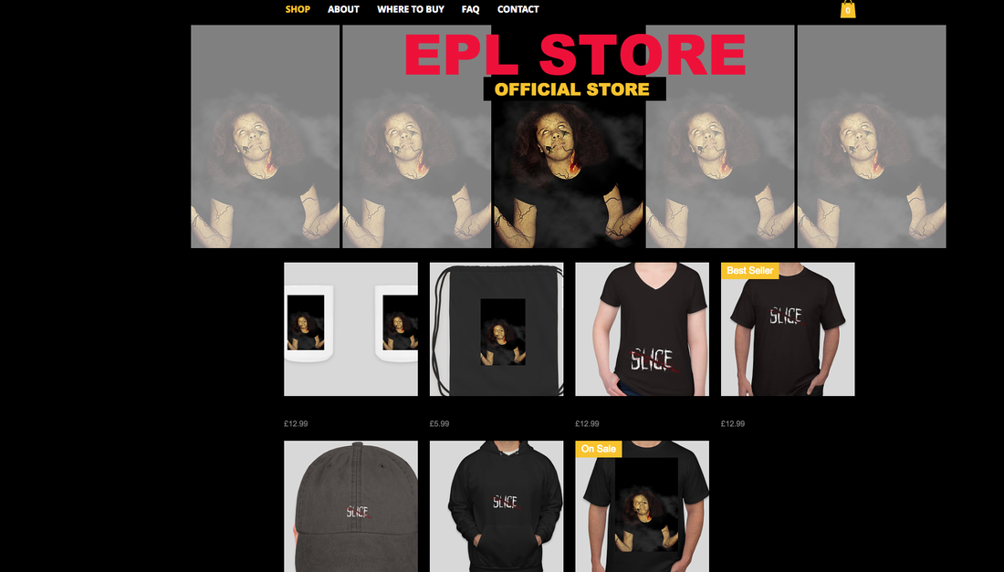
Here we have screenshots of our official online store where you can buy merchandise such as t shirts, mugs, bags and hoodies. The EPL Store can be compared to the Disney store and is a subsidiary of the EPL Company. This website will act as a form of additional revenue and will appeal to fans that want to get more of of their experience with the film. It also closely resembles our color scheme of red, yellow and black so that way we are keeping a consistent house style.
|
|
|
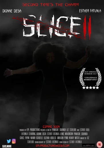
SLICE 2 SEQUEL POSTER
|
This is the official teaser poster for the Slice 2 sequel. The movie will continue the development and story of some of the main cast, and will include the return of the antagonist and how she goes back to attack the main cast. The poster uses the same house style as the original poster with the black, white and red colour scheme so it is still recognisable to fans of the first movie. I edited the poster to make it look more mysterious and almost ghostly so that tells people that the movie may potentially have more supernatural elements in the film.
|
Example of Real Media Text 3
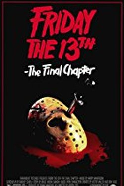
Friday the 13th by Liz
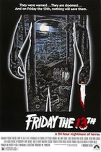
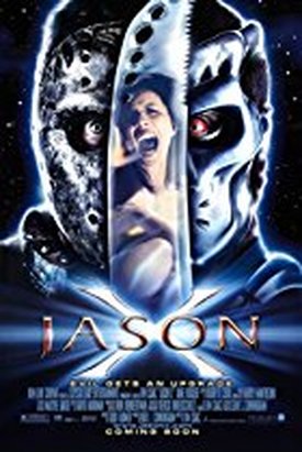
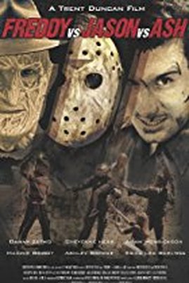
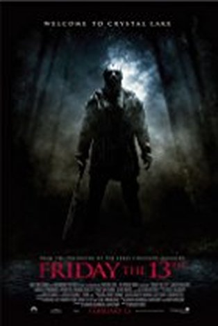
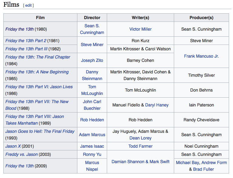
Friday the 13th is another successful franchise in the film industry. It was distributed by Paramount Pictures and created by Frank Mancuso Jr. The producers of this film are Michael Bay, Bradley Fuller, Sean Cunningham and Andrew Form. The first film was released in 1980 with a box office of $59.8 million and made the most money out of all the recreations of the movie. There are officially 8 movies of Friday the 13th and 4 crossover movies based on the antagonist in the movies, Jason. There are 13 soundtracks in total for the movie and the franchise itself grossed an estimate of over $464 million.
|
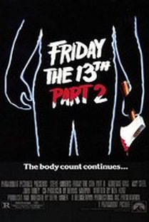
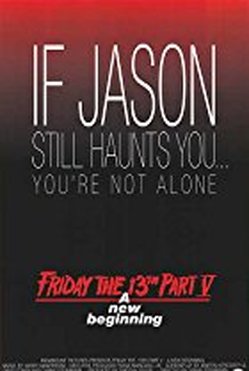
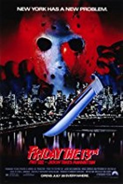
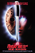
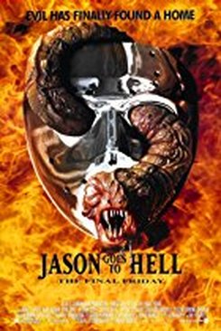
As you can see the first 3 movie posters had a consistent style i.e. a figure of a body (most likely the antagonist) however for the remaining posters, the franchise changed the style by replacing the bodily figure with the antagonist's face/mask. Despite this slight change in the appearance of the poster, the font has remained the same. There are slight changes in the title such as the colour, whether it's inverted or a whole other colour, the size, the position etc but nevertheless, the font has remained the same. The only other changes in regards to the text were applied for the crossover movies where instead of using the text as a way to familiarise the audience with the franchise they've included the antagonist's name. They were able to do this successfully because at this point, the franchise was well known therefore resulting in the antagonist's identity also being well known. As well as the name "Jason" being put on the posters, the recognisable iconography of the mask means that it could be included on the
|
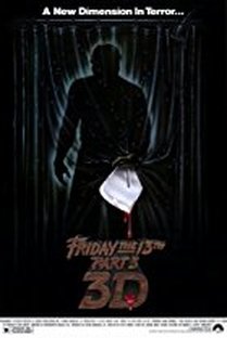
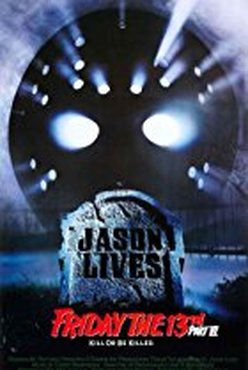
front cover so if the name wasn't recognised by the audience (highly unlikely at this point as it is now the 13th movie to do with the antagonist, the mask is a well known icon that relates to Friday the 13th and therefore the antagonist on the poster would be known. The weapon that the antagonist is well known for using is also denoted on a few of the posters therefore enforcing that recognition within the audience. The trailers have also kept the antagonist included in them to further emphasise the main character and creating familiarity within the audience.
|
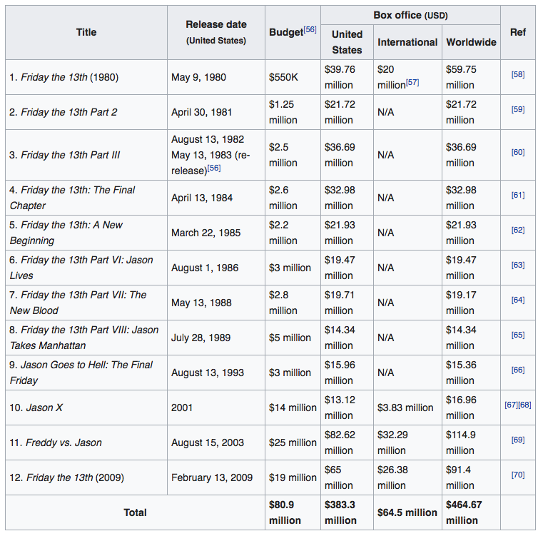
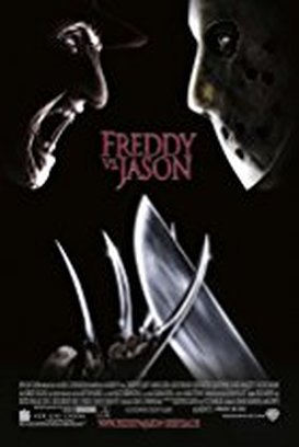
Based on the analysis of the movies, "Freddy vs Jason" grossed the most for box office. I believe that this is the case based on synergy. Because the film was a crossover of two, the audience and fans of each movie have come together to view this film therefore allowing the audience number/ the box office to increase. However, the movie also had the highest budget from which I can infer that the more money invested in a movie, the more money a franchise can make therefore increasing the amount of profit made. Furthermore, before the release of the crossovers the box office the numbers of the movie was n average below $20 million however after the crossover movie, the exposure the film got through promotion, marketing and the actual production budget all allowed the profit to be over $72 million.
Brand Identity
|
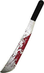
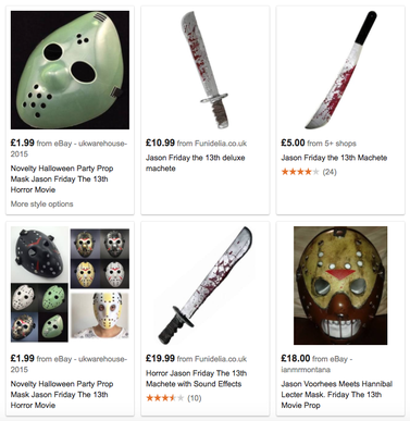
Friday the 13th, as mentioned above, the movies all have the recognisable props (also known as iconography of the movie) that allow familiarity within the audience of the movie. One of these are the mask used to seal the identity of the antagonist Jason. This mask is printed on the posters of at least 7 of the movies and gives the franchise/brand some identity as it allows recognition of the main character in the movies. Another piece of iconography that contributes to the brand's identity is the weapon used by the antagonist. It is a machete and is well known to be used by Jason throughout the movies.
|
Other forms of media
|
Friday the 13th further expanded the type of media they produced and created a game from their franchise "Friday the 13th ; The Game". The game was produced May 26th 2017 and developed by IIIFonic and is a video game that can be played on PlayStation 4, Xbox One and Microsoft Windows and further allows not only one person to play but up to 7 players allowing interaction between those interested in the game; even if they aren't initially interested, they could be influenced by their friends and players.
|
|
|
|
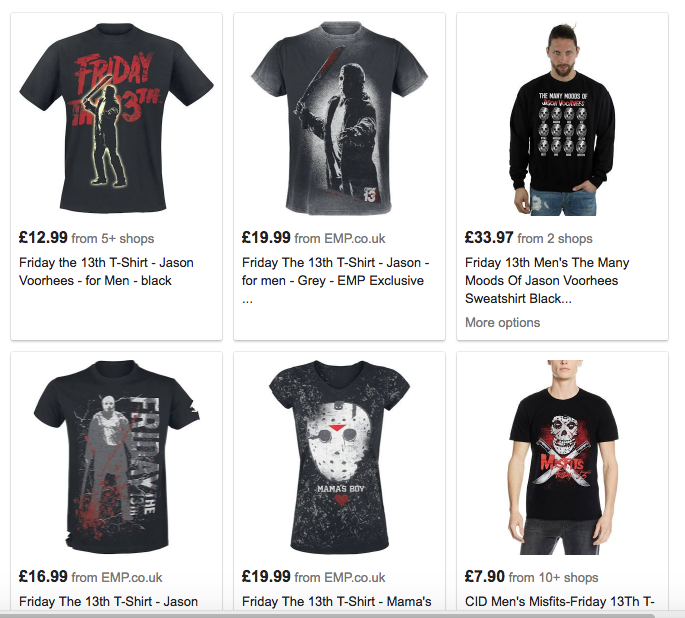
There is also merchandise that not only the franchise sells, but also individual companies and businesses to also make money from the franchise. The merchandise that is sold to represent the franchise includes t shirts, mugs, jumpers and even replicas of the actual props used in the movie such as the mask, or plastic versions off the machete. Fans are able to purchase this and this allows further marketing of the franchise as once they use these props other people may be interested and also purchase it etc.
CONCLUSION
My main product is effective in combination with ancillary texts because it is consistent and carries out our brand identity for example the colours, fonts and characters, by promoting our film in different ways it helps gain the audiences interest. We also explore the ways in which our brand identity can be exposed in.In todays day and age we use cross media convergence and synergy to enable us to market our film to a larger audience. On the other hand we did focus on producing media that targets our target audience for example free apps that they can download and interact on/with. By just using cross media convergence we are branching out to a larger audience which will make more people want to watch the film benefiting us as producers, this will ensure the films success in the box office. In addition we examined other franchises and how they used cross media convergence again these are quite conventional as the same techniques have been repeated allowing us to imitate there use of cross media convergence. We looked at The Nightmare on Elms Street, Friday 13th and Saw. Saw was a very successful film with the highest gross however all films managed to earn significantly g=higher than there budget which shows the effectiveness of using our main product with ancillary text, as they were able to continuously market the film brand through there film products.n Brand Identity is important for all film companies and shows continuity as without it the brand would be unrecognisable.An extremely strong film brand can be identified with a specific genre for example in Nightmare Elms Street Freddie Kruger is and iconic character and is also that films bran identity when the audience or viewer sees Freddie Kruger with the same propped make up and clothing they associate him with the horror genre (slasher).Our brand identity is shown through our text and our main character.We also researched the ways in which we could use synergy and cross media convergence an example of synergy would be which our amusement park rides which helps to promote the film even more. Looking at cross media convergence was helpful as we created video games as well as apps which will make our audience what to what our film.
ESTHER FATUINLA
