
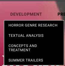
Research and planning:
There are both benefits and negatives of new technologies to the audience/consumers and the producers. The production costs have reduced price and made it easier. Over time media technology has improved and developed and helped us use media in different forms and there are different programmes and tools. Because technologies are in our lives so much and we are becoming a digitalised society the media adjust and develop themselves in order to benefit consumers as an audience can view media texts in different ways. Technology is important especially in this aspect because it has allowed us as a team to conduct our research and be experienced when it comes to knowing the key conventions of trailers.Media has also allowed us to promote and advertise our trailer poster and magazine.Using technology is extremely helpful and beneficial because our target market is indulged in the digital age and turn to it for everything. It has now become the norm to own devices such as phones, i pads and computers which have all enabled us to complete our production as well as advertise, market and communicate with eavchother as a team and to our consumers.
BY ESTHER FATUNLA
BLOGGER
Blogger is a blog which is cost free and used online, we used this to upload things individually so it could be marked my our teacher and not as a team.The blog also shows the dates and times at which the work was posted so the teacher was able to see if we are on track and if we are meeting the deadlines the teacher can also leave the feedback needed for us to improve on our next post. this was very useful it allowed the teacher and the students to interact.This benefitted us because we were able to perfect what is going on our weebly team blog.This allows us to embed videos and images which help give examples so the readers will be able to understand and pinpoint what we are referring to as well as real media texts to compare to what we aspiring to achieve.Using blogger was useful for the group because it allowed us to organise what we would post and was easily accessible, it also helped us make sure all the tasks where completed. In addition the layout for blogger can be changed which makes it interesting and different compared to everyone else's blogger accounts, this ensured that our blogs as layouts could be altered to make it more aesthetically pleasing.
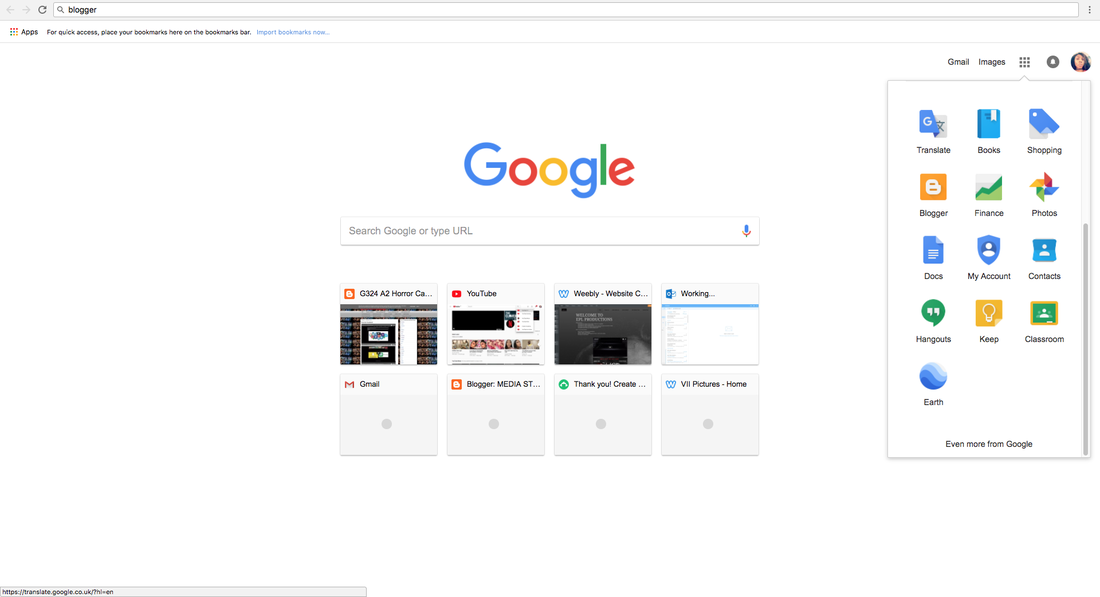
On the left hand side you can see the section where blogger is if you are signed in to google it makes it extremely easily to log in to blogger
|
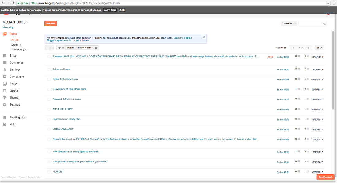
This is an example of the work we were set as shown they have been viewed and commented on it also allows you to edit these posts if need be
|
|
|
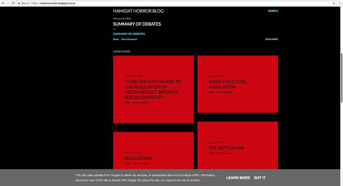
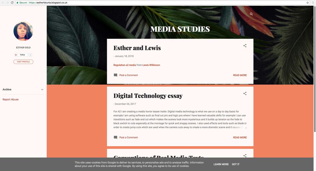
I put these too blog posts next to each other to show the variation of designs one can use to make there posts look different and unique. These both look different the one on the left is black and red with small boxes which can be clicked on to access the work however the one on the right is boxes going across the page using the colours peach and green(green leaves).
WEEBLY
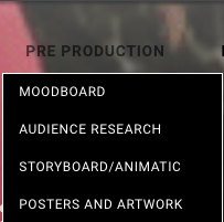
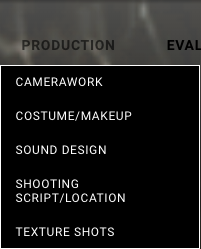
Weebly is another free website which was last year was created by our teachers and our logins were given to us however we needed to create these blogs by ourselves this year. it is a free online website which was created, designed/modified by us as a team which can be accessed by our audience/readers using the link http://eplproductions.weebly.com. By using weebly we were able t each page using gifs and using music to draw the interest of our viewers and so they can immediately identify the blog as a horror.On our blog we have a team log to show what we have done and that we are contributing to,our team profiles are also accessible where we put our pictures and details about us to make sure the audience knows us a little bit better as the producers of our final media products. It can also be traced were we done our development stage including research especially with the different genres, textual analysis, film concepts and our treatments, all of these where essential to ensure the media product we produced was successful. Pre production work that we did including audience research, mood boards, story boards, drafting and an animatic as well as the costume and make up as well as sound design has been included on our website. Our final product has been posted on our home page and our evaluation has also been published. All of the work is clearly presented under categories. Using weebly meant that we could easily embed images, videos gifs, sounds and documents onto the website to give evidence of the work we have done or to show other media texts that we worked on as a group. this was extremely easy to do.In addition the website can be accessed on many devices for example phones, computers at school as well as at home which meant that we were able to edit and add important details to our work which had already been published and can be edited based on the feedback we were given.
|
This tab is extremely useful as you can just drag the item in which you want and you are able to do what you would like for example this text box was dragged here once I clicked on the text tab. this is also useful for embedding videos from youtube.
|

|
|
|
|
PRESENTATION AND SOFTWARE USED WITHIN RESEARCH AND PLANNING
When doing our research and planning tasks we wanted to present them in different ways to show variations in the way show our work. This makes it aesthetically pleasing for the audience so we present using softwares such as prezi, thinglink and photoshop.
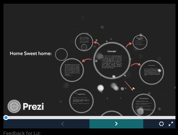
PREZI
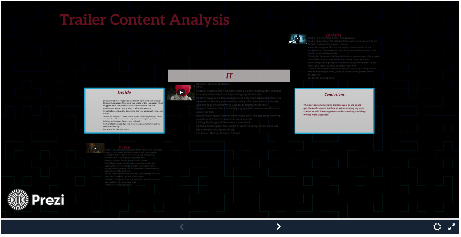
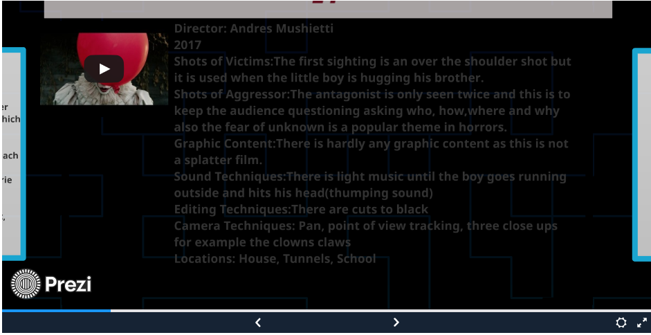
Prezi is also a different way to show our work creatively when doing our research and planning tasks. this was useful as it allowed us to embed YouTube videos when needed.It also allows the audience to zoom in and out on certain aspects of the presentation that the audience is interested in rather than having to scroll which is beneficial because we don;t want the receiving end to do too much work.
|
|
EMAZE
Another example of software is Emaze which is easy to create. This is like a powerpoint creator which allows us to use many things in it for example gifs and videos and hyperlinks. This is aesthetically pleasing and allows the audience to enjoy the information being displayed. It also allows us to put sound on it so the audience can chill and relax and get into the mood as the music belongs to the horror genre.
YOUTUBE
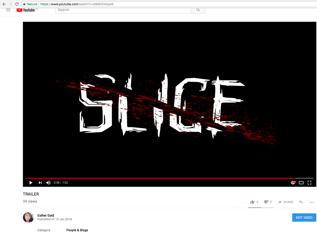
We used YouTube at all times of our development work. Youtube is a social media platform which enables us to share and view videos. This platform is used by millions of people almost every day. By creating a free account we are able to distribute our product to a global audience. Using this platform also helped to embed it into weebly. YouTube is also helpful with feedback as everyone with an account can subscribe, comment(what they like or don't like) and share the video.We also used YouTube to research real media texts for example horror trailers. YouTube gave us inspiration as there are so many videos out there.
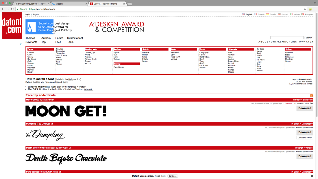
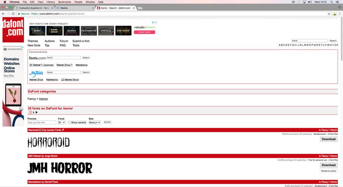
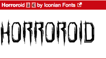
DEFONT
DEFONT is a website that gives different fonts for people to use. We used this site to find the most suitable font we can use for title slates in the trailer and text that suits our genre trailer, poster and magazine to make sure we keep a consistent house style and brand identity. Using this provides professional looking texts. Due to experience of looking at other titles we were able to carry out the key conventions of texts. After looking at horror tiles we found that the filter on the extreme left was most suitable.
|
|
|
BY ESTHER FATUNLA
Construction:
By Panashe Sibanda
Photoshop:
|
|
Our group used Adobe Photoshop to create our official poster and to edit the images for both the poster and the magazine. We had previously used adobe Photoshop to edit our AS music magazines and our preliminary tasks, so when we began the editing of our products, we could hop straight in and use our existing knowledge, as well as experimenting with different tools and methods to create something innovative. Photoshop contributed greatly to our creativity whilst in the process of producing the magazine and poster. I used layers to help me add different textures that I created onto the main image. I used a tearing and vein looking texture to create a much more grotesque effect and to make my subject look much less human like, and this was accomplished through my use of layering, the rubber tool and blending the different layers together to make it look like one cohesive image. I also used Photoshop to create the actual title and name for the poster by using the polygonal lasso tool so that it creates a slice effect through the title, which is in clear reference to the name.
|
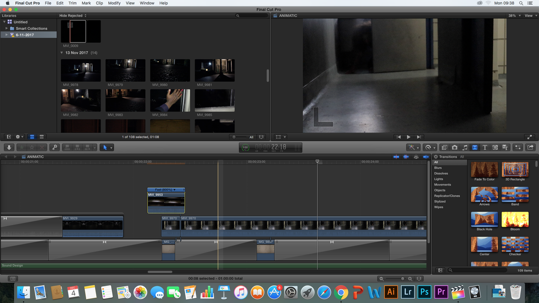
Final Cut Pro:
|
Our group used Final Cut Pro to edit the shots filmed and fit in sound as well to complete our teaser trailer which available on macs. We had not used Final Cut last year however we already had experience at using Final Cut prior to this as we created animatics which required us to find out/play around with the features available. As we had never used it prior to the creation of the trailer, we had to watch multiple YouTube tutorials to teach us how to use different features. We used the cutting tool to slice out certain parts of our trailer as well as colour grade certain scenes. This was of course done to help create a certain atmosphere and evoke a different mood. This software helped our work look more professional. Final Cut Pro allowed us to combine different shots taken, and enabled us to add effects , pace and colouring (hues and contrasts) in order to follow the colour scheme we have that is part of our brand identity and the genre of our horror film. We used a tutorial guide to assist us and teach us how to colour grade our footage. The program provides a timeline meaning we could organise all the different parts included in the trailer which meant we could insert parts precisely for example sounds could be placed with the correct timing. This allowed
|
During the evaluation we used Apple iMac in order to produce our work. This is of course successful as it allowed us to use Final Cut Pro which is a great software to edit on. This software is also used by professionals so it ensures that our media product has been produced to the best of our abilities and is high quality. We also used Final Cut Pro to create practice trailers and our animatic so that we could get used to using this software. Final Cut Pro allows us to upload onto YouTube which then enabled us to embed it on our blog.
ESTHER FATUNLA
Adobe InDesign:
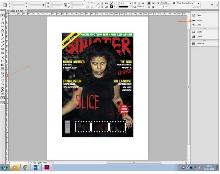
|
When it came to constructing the actual horror magazine, we used adobe in design. This software was used previously in AS when it came to creating our music magazines and preliminary college magazines. This then meant that we could jump straight into the creation process as we already had prior knowledge on how to use the software, and how to structure a magazine. We used layers, similar to how we used them in Photoshop, to allow us to edit certain aspects of the magazine without accidentally editing the other parts of it. We were also able to create graphical elements such as the one at the bottom which looks like a film tape and the blood effect on the masthead of the magazine. These effects make the magazine look more appealing and attract audiences. |
Camera/Camera Equipment:

|
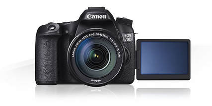
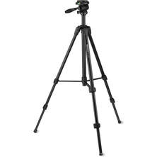
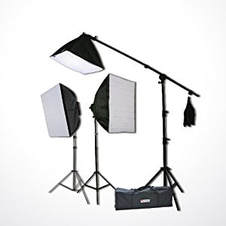
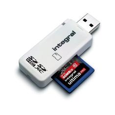
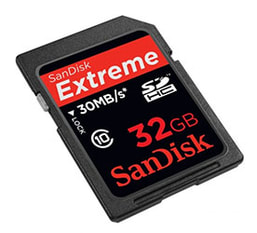
In order to shoot the footage and images for our trailer, poster and magazine, we required a camera so we used one of the canon SLR cameras provided by the college. The ISO feature also allowed us to change the lighting settings on the camera to get the correct level so that the scene could be darker or lighter which in addition, kept our footage from becoming blurry. Included in the camera was a 10x optical zoom which allowed us to record certain scenes from certain distances depending on the scene. The college also provided us with camera equipment to assist us in our filming and this included a tripod, a card reader, an SSD memory card and a lighting kit. The tripod allowed us to take very stable footage and photos, made panning shots for example much easier and more fluid which made our photo's and trailers look more professional. We used the lighting kit to adjust or enhance the lighting for the footage/photos of our magazine, poster and trailer. Most of our locations were dimly lit, as it should be, so the lighting kit was extremely helpful as it allowed us to easily control the lighting in our different situations. Finally, we were provided with USB card readers and a memory card from the college to allow us to store our footage and images on a hard drive. My team also used google drive to back up all of our work just in case the physical copies became damaged or lost, that way we do not lose any of our work.
|
Evaluation Q4: Liz
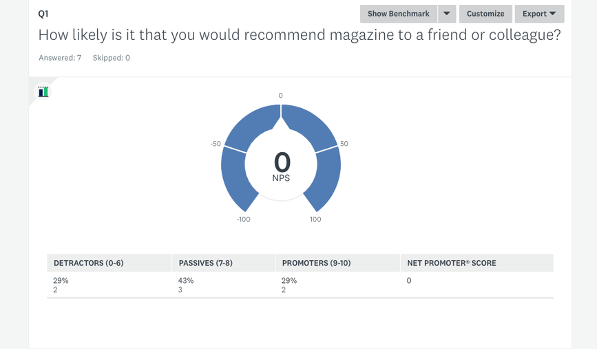
Microsoft Excel : Tables formed with questions splitting the answers according to age and gender.
Sites such as YouTube with professional official trailers helped with ideas of what conventions we should include in our trailer. Target audience of existing horror products influenced the decision of what we included in ours.
Horror movies were also watched for further research in conventions to include i.e. dark lighting, religious references being subverted.
Lighting such as from a low angle to create facial shadows creating a more mysterious/sinister imagery.
Software such as Adobe InDesign and Photoshop were used for creating the layout of the magazine. Used to insert conventions of the magazine such as mastheads and using particular fonts to create the horror imagery. Fonts downloaded from "DaFont" provide some graphical fonts which relate to the genre i.e. Microsoft word only has fonts which don't portray the horror genre however DaFont provides some.
Adobe Photoshop was used to edit the photo (dominant image) i.e. creating an outline around the main character in the dominant image to insert on Adobe InDesign in front of the masthead however allowing the name of the magazine to still be visible.
During the planning and research stage, I used a variation of sites which offered different presentation layouts for aesthetic purposes, in order to prevent those viewing the pages/site to find the site tedious therefore discouraging them from reading on.
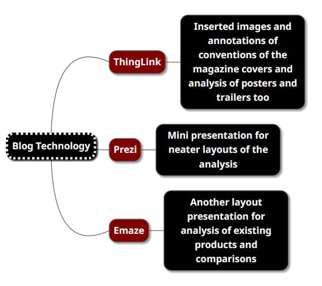
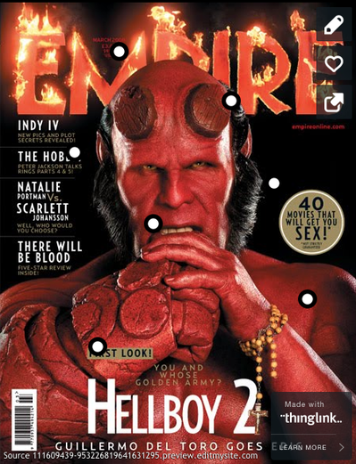
Thinglink:
An example of a site I found useful to vary my presentation skills was ThingLink. This website came in handy for annotations as it allowed me to insert circles wherever I pleased. These circles, when hovered over with a mouse would then present the viewer with a paragraph or sentence of annotations on whatever the circle is placed on. This allowed viewers to read in depth explanations of particular conventions.
An example of a site I found useful to vary my presentation skills was ThingLink. This website came in handy for annotations as it allowed me to insert circles wherever I pleased. These circles, when hovered over with a mouse would then present the viewer with a paragraph or sentence of annotations on whatever the circle is placed on. This allowed viewers to read in depth explanations of particular conventions.
Emaze:
Another website used to vary my presentation and notes was Emaze. Emaze is very similar to Powerpoint and allowed me to create slides and fill them with annotations of images along with text. This was a way of presenting notes in a neat layout.
Another website used to vary my presentation and notes was Emaze. Emaze is very similar to Powerpoint and allowed me to create slides and fill them with annotations of images along with text. This was a way of presenting notes in a neat layout.
A software I also used for my audience research is Microsoft Excel. This allowed me to insert information consequently leading me to have statistics for judgement made on my magazine's front cover. I separated the genders once I received results from my questionnaire to see if there was anything that could indicate whether gender determined how interested/attracted an individual of a particular gender affected their opinion; aspects such as the colour scheme helped determine this. Stereotypically the colour scheme chosen for the front cover would cause females to not be attracted to the front cover as they're dark and "masculine colours". This therefore lowered the preference of my front cover from girls because despite the target audience being teenagers, conventions such as the colour scheme could decrease the number of those interested. Nevertheless, the colours used are suitable for its genre because they have negative connotations.
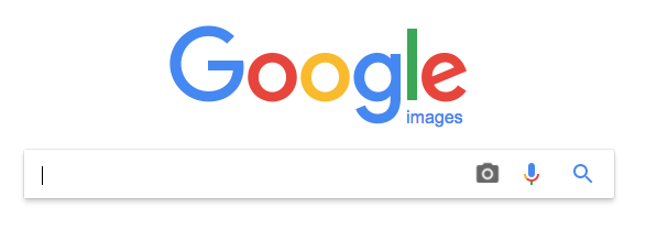
Google Images:
Google images was a useful search engine for examples of past professional magazine front covers and helped me majorly decide on which conventions to use. This provided me with reasons as to why they should be used. It was easy to use this for research and planning purposes. This search engine allowed me to access a large variation of images for research and comparison purposes
Google images was a useful search engine for examples of past professional magazine front covers and helped me majorly decide on which conventions to use. This provided me with reasons as to why they should be used. It was easy to use this for research and planning purposes. This search engine allowed me to access a large variation of images for research and comparison purposes
Furthermore, another form of research completed for this stage (and development) is actually watching horror movies and/or their trailers. This dominantly helped the trailer section in regards to comparisons and including similarities to allow our trailer to resemble some of the RMT. This also helped in regards to ensuring that although the products are different, they market/ promote the same film and therefore must have similarities. For example the logo shown in the trailer must be the same on the magazine and poster.
Prezi:
Prezi is another software very similar to powerpoint and Emaze however keeps its viewers interested and interactive. The transitions between slides changes the typical slide to slide. A feature it has is allowing viewers to zoom in where needed whether it be videos or images which is very useful for viewing detail where I have inserted annotations.
Prezi is another software very similar to powerpoint and Emaze however keeps its viewers interested and interactive. The transitions between slides changes the typical slide to slide. A feature it has is allowing viewers to zoom in where needed whether it be videos or images which is very useful for viewing detail where I have inserted annotations.
Surveymonkey:
Surveymonkey was a very useful site in regards to getting feedback from the audience. This feedback was useful as it allowed my group to hear opinions of an audience; those surveyed were teenagers which allowed the feedback to be more effective because that age group and their opinions reflected teenagers worldwide. By improving on their feedback it allowed our media to have the chance to attract a larger audience.
Surveymonkey was a very useful site in regards to getting feedback from the audience. This feedback was useful as it allowed my group to hear opinions of an audience; those surveyed were teenagers which allowed the feedback to be more effective because that age group and their opinions reflected teenagers worldwide. By improving on their feedback it allowed our media to have the chance to attract a larger audience.
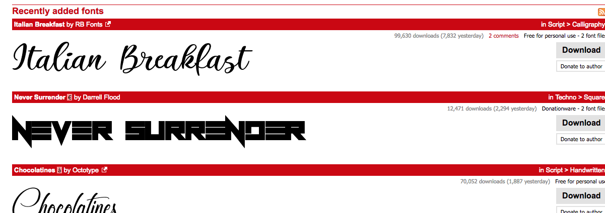
DaFont:
A website used for some of the fonts used on the magazine is Dafont. This site allowed me to have a variation of fonts and especially those that suited the horror theme rather than the typical microsoft fonts. The site offers all sorts of texts which helped with suiting the theme e.g. my masthead has a bloody look to it. This allows people to infer what the magazine's theme is to
A website used for some of the fonts used on the magazine is Dafont. This site allowed me to have a variation of fonts and especially those that suited the horror theme rather than the typical microsoft fonts. The site offers all sorts of texts which helped with suiting the theme e.g. my masthead has a bloody look to it. This allows people to infer what the magazine's theme is to
EVALUATION
For Post Production we used technology such as youtube, powerpoint, final cut pro and Apple Macs and photoshop. Technology is extremely helpful as
as we can use this easily accessible and allow us to produce products to almost replicate real media texts. For example by using Apple iMacs helped us to share the same files without them changing formats which was helpful as we were working in groups, so it was easily transferable.
In addition we used Photoshop in our evaluation we made cross media products such as the interactive billboard. The real billboard it would be on is in busy street due to the large concentration of people which enables us to attract a larger amount of people.I used Photoshop to put clips over the images to place it in the designated place and size and adjust the video.
ESTHER FATUNLA
